Web Design Critique #45: Optimized Cable Company
Every week we take a look at a new website and analyze the design. We’ll point out both the areas that are done well in addition to those that could use some work. Finally, we’ll finish by asking you to provide your own feedback.
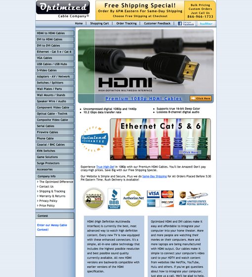
Today’s site is Optimization-World.com, home of the Optimized Cable Company.
The Ultimate Designer Toolkit: 2 Million+ Assets
Envato Elements gives you unlimited access to 2 million+ pro design resources, themes, templates, photos, graphics and more. Everything you'll ever need in your design resource toolkit.
If you’d like to submit your website to be featured in a future Design Critique, it just takes a few minutes. We charge $49 for critiquing your design – considerably less than you’d pay for a consultant to take a look at your site! You can find out more here.
About Optimized Cable Company
Every cable sold at Optimized Cable Company is guaranteed for life. If your cable ever fails, just return it to us for a no-hassle replacement. We take great pride in offering high-quality cables at very fair prices. Don’t over-pay for your cables at the department stores. Order from us and take advantage of our free shipping special. We don’t nickel-n-dime you. The price you see is the price you pay.
Here is a section of the homepage:
Initial Impression
There are some good ideas at work here, however, on the whole the design very closely mirrors something that would’ve been fairly common around ten years ago. Web design trends are something that merit attention when you set out to design a website. Not so you can ripoff the ideas of others, but so that you ensure that your final product feels modern and relevant.
As designers, it’s too easy for us to get stuck in the way that we approach a project. The negative effect of this is that the world changes while we stay the same. Having a website that feels outdated is especially dangerous for online stores because it can directly relate to lower sales. Visitors stop by and are suddenly unsure as to whether or not the site is a safe place to spend money. Is this a legitimate corporation that will protect my credit card information? Or is their site security out of date? In this case, I might move on to Best Buy regardless of the cost and quality of the products just because the site feels safer.
Admittedly, it’s hard to pinpoint exactly what distinguishes a modern design from an outdated one so today we’ll comb through and see if we can identify which aspects are directly affecting our impressions about the time period.
Header

The first thing that catches our attention here is the logo. It’s a heavily glossed element that feels like it’s from the early web 2.0 period. Gloss can still work in many web designs if done properly, but here this particular element feels out of place. Virtually nothing else on the page matches this look and feel, including the text on the logo, which feels more like something from a vintage car ad (more time period confusion).
Next, we move onto the yellow gradient. This color really violates the scheme of the rest of the site. Marketers like this because it stands out but from a design perspective it just feels all wrong. Colors that complement can stand out and call attention without clashing. Further, even without consideration for the rest of the site, the yellow gradient is another thing that doesn’t reflect current trends.
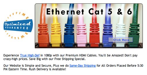
To see what I mean, let’s compare the shipping banner on the site above to the same element on the Staples website.

We can learn a lot from this. First, the layout is a lot roomier and spacious, everything isn’t crammed in so tight. We see some strong left alignments in place as well, as opposed to comparatively weak center alignments. Notice that the key here is subtly. There are gradients and even a texture created from thin lines, both of which we see on the Optimized website. However, on the Staples site, these elements are much more subdued. Both the gradients and the lines are easy to miss if you’re not paying attention, meaning they add to the aesthetic without being distracting.
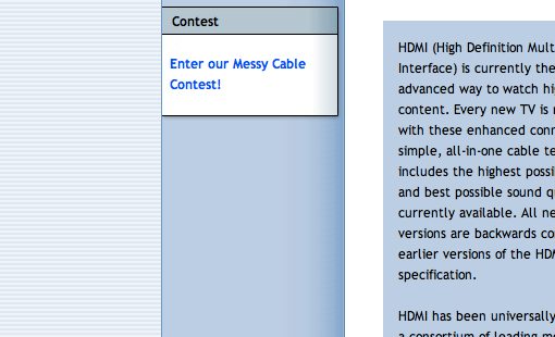
Colors and Textures
As we move down the site we can see more of this idea that the colors and textures are playing a large role in the impression of a time period. In the screenshot below we see this in play along with strong use of hard corners with single pixel black strokes bordering them. This creates a boxy feel that reminds me of some work that I did for a client once in a CMS called Plone.
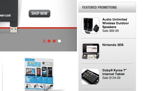
Again, let’s compare this to some of the treatments that we see in a similar area of a major competitor’s site. The screenshot below shows the sidebar from the Radio Shack homepage. This company isn’t exactly a perfect picture of modern business practices but they are attempting to keep their site looking fresh and relevant.
Photos & Text
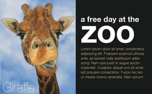
Along with the graphical elements on the page, you also have to watch how you structure your image treatments. The photo below really doesn’t have any good area of solid color on which to place text, so the text was given an awkward ghosted shadow treatment to help it stand out.
Sometimes you have a photo that genuinely won’t work with text. Rather than attempting to stick the two together when it simply isn’t working, consider an alternate route. We have an entire article devoted to Designing with Photos that shares some awesome tricks for how to combine text and photography in an attractive and readable way.
Text & Logos
The final portion of this page that I want to address is shown in the image below. Here we have a whole gaggle of logos, some of which are arguably necessary but I’m definitely not convinced that they all need to be there. Accreditation from the BBB is good, but do I really need to know that the site uses the U.S. Postal Service? It’s pretty much a given that if I buy a product online, it’s going to be shipped to me somehow and most of us take the U.S. Postal Service to mean “regular old mail”.
Further, the credit card logos could probably be moved to the payment page. Most consumers comfortable enough to make an online purchase are going to assume that you take major credit cards.
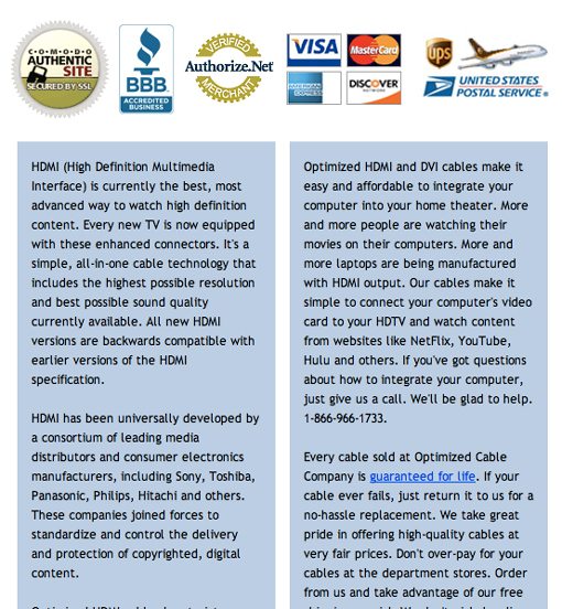
Finally, what comes next is a huge block of uniform text. There are no headers, icons, differentiated text treatments (aside from links) or any other tricks used to break this up and make it more readable. At a glance I don’t even know what this chunk of text is about so why would I take several minutes to read it?
In web design, you simply can’t expect visitors to tackle a chunk of pure text like this. One in a hundred visitors might actually go through the first paragraph, but that’s being optimistic. Does that mean you can’t have a lot of text on a web page? Absolutely not. You just have to learn to break it up into meaningful and manageable chunks that can be browsed quickly for relevant information.
The designers at MailChimp are stellar at this and I always refer to their work when discussing this topic. Their recent site redesign tackles has a features page that’s full of text, but check out how they handled it:
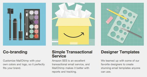
Strong headers, brief blocks of text and images that hint at the content are all used here to make all of this content easily digestible.
Recommendations
To bring this site into 2011, I recommend that the designers take a hard look around at other websites, both in their field and out (our Design Gallery was created exactly for this purpose). Investigate more into what sets modern sites apart from the trends and tactics seen on the Optimized site.
Your Turn!
Now that you’ve read my comments, pitch in and help out by giving the designer some further advice. Let us know what you think is great about the design and what you think could be stronger. As always, we ask that you also be respectful of the site’s designer and offer clear constructive advice void of any harsh insults.