15 Tips for Designing Terrific Tables
Tables of information are boring. In a sense, they’re meant to be that way. A good table communicates a lot of information in a concise, easy to understand way. Because the emphasis really should be on the information, over-designing a table can kill the effectiveness. However, in the right hands, clever design can not only make a table more attractive but can actually increase readability.
Today we’ll take a look at several ways you can improve the functionality and aesthetics of your tables. One of the most common places we currently find tables online is on a web app’s pricing page so most of our examples will take this form, just keep in mind that these principles can apply to any type of informative grid (whether or not it’s actually a table).
2 Million+ Digital Assets, With Unlimited Downloads
Get unlimited downloads of 2 million+ design resources, themes, templates, photos, graphics and more. Envato Elements starts at $16 per month, and is the best creative subscription we've ever seen.


Vertical, Horizontal or Matrix?
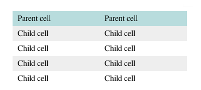
As always, we’ll start with the obvious. The first step is deciding on a general structure of your table. The structure you should choose depends on the type and complexity of the information you’re presenting.
Choosing between vertical columns and horizontal rows can largely depend on personal preference. Sketch out your content in each form and decide which method you think conveys the information best. Obviously, if your message is based on multiple variables, a matrix is the way to go. Here are a couple of examples:
Vertical
Horizontal
Matrix
Start in Excel
For the record, this is the first, and hopefully the last, time you’ll hear me suggest using Microsoft Office for anything design related. The truth is, tables are undoubtedly easy to make in Excel; that’s pretty much what it does. Compare this with the time it takes you to hard code the organizational structure in HTML and Excel will win every time.
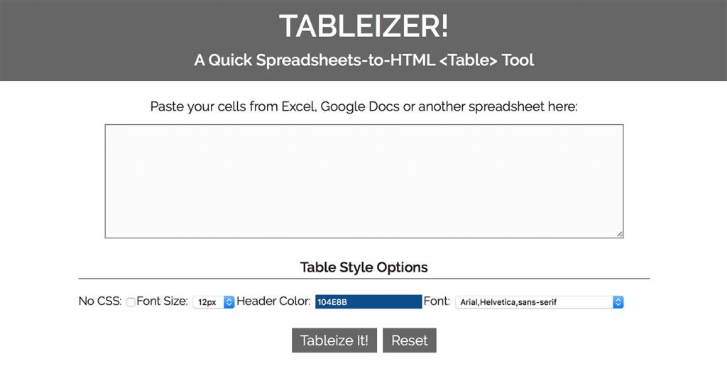
Today I stumbled across a great little web application called Tableizer that allows you to paste in your tables from Excel to magically transform them into HTML. You’ll still have to handle most of the styling on your own but you’ll definitely save some time on the front end.
Tableizer
Use a Table Generator
Hate Excel? Don’t feel bad, me too. If you’re still looking to save yourself some time on creating the basic skeleton of an HTML table, there are tons of online generators that will get the job done. Note that I said “basic skeleton,” don’t go thinking you’re done after using one of these to cheat your way out of a little coding. You’ve still got a long way to go if you don’t want it to suck.
Here’s a quick list of free table generators to save you a Google search:
A Little Styling Goes a Long Way
Now that you’ve got a basic table, the first step towards taking it out of the 90’s is to add some CSS. Of course, you can go crazy and spend hours experimenting with different styling options, just remember that even a little bit of color and font styling can drastically improve both the readability and attractiveness of the table.
This is an old, but still relevant, tutorial on basic table styling with CSS that covers the basics.
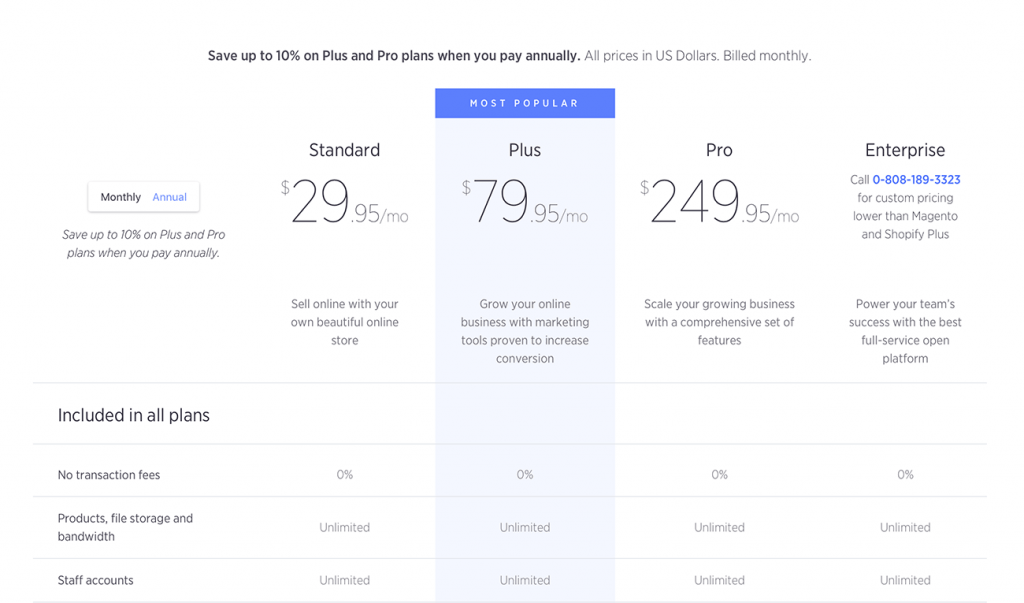
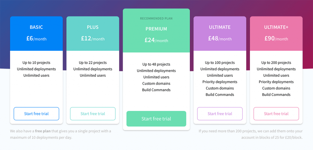
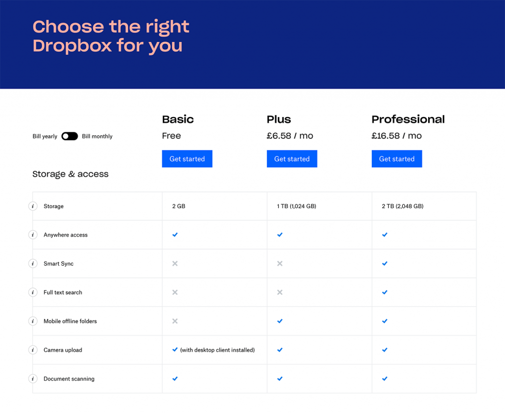
Add a Featured Section
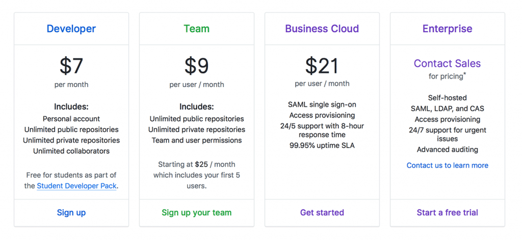
This is extremely common in pricing tables but is applicable to any table. Think about the information in the table and consider whether you want the viewer to focus on a specific portion. Whether it’s the plan with the best value or a popular element in a list of features, try varying the color and/or size to make it stand out from the rest.
There are definitely plenty of ways, both subtle and over the top, to make the featured section stand out. Here are a few for inspiration:
Color Differentiation
Size Differentiation
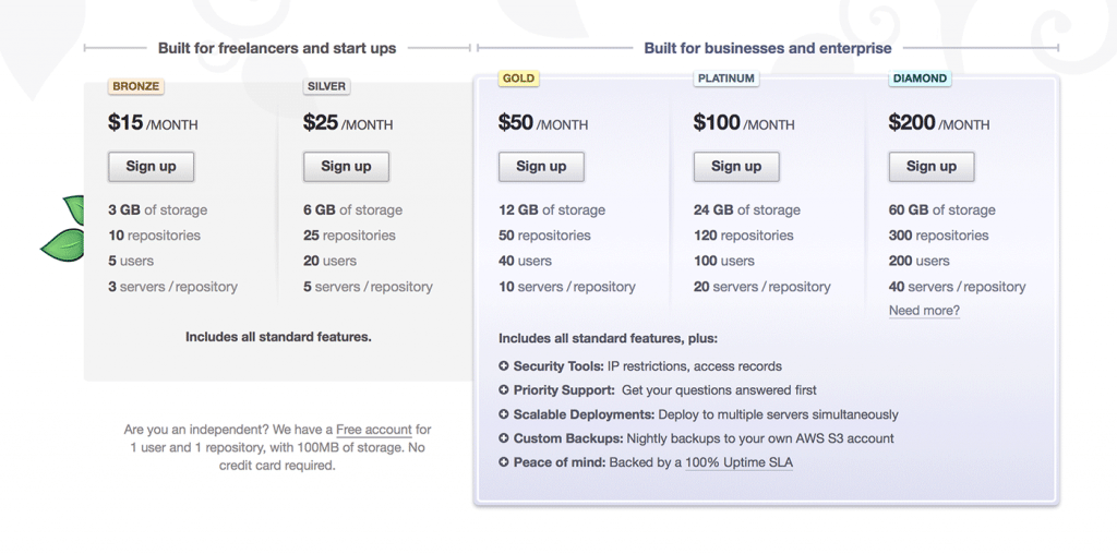
Color & Size Differentiation
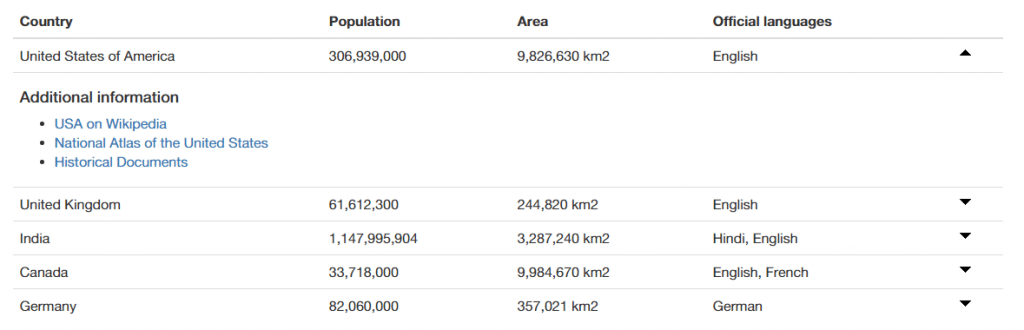
Make the Information Sortable
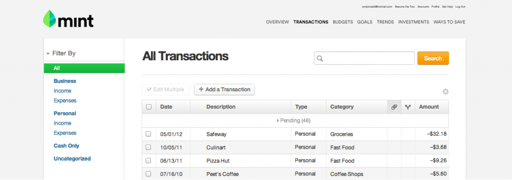
If you’re creating tables with a lot of information organized into several columns, it’s a good idea to consider adding a sort feature so your users can choose the way they want to see the information organized.
Mint.com integrates table sorting into your list of transactions, making it super easy to change from a date-based view to a category-based view so you can identify areas where you tend to spend a lot of money.
Here are a couple of jQuery plugins that give you a quick way to add this functionality:
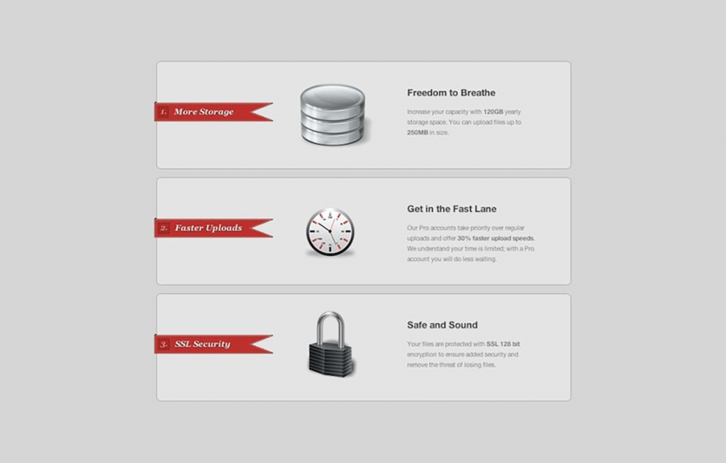
Use Icons
As I said above, the point of organizing information into tables is to make it understandable at a glance. By cutting down the necessary reading, well-designed icons can drastically improve the speed at which a visitor can comprehend the information in your table.
Beware, this goes both ways. Sloppy icons can leave your users scratching their heads trying to figure out what you’re trying to communicate.
Add Zebra Stripes
This is a pretty basic idea dating back to as long as tables of information have existed. Adding alternating row colors helps your eyes follow the line of communication and connect the floating information in the center of a table with the anchored category on the side or bottom.
This simple technique can increase the readability of both large and small tables, but it’s a good rule of thumb to always include stripes (or some other visual aid) if your table requires the reader to connect pieces of information that are more than an inch or two apart.
It’s super-simple to do with CSS:
tr:nth-child(even) {

    background-color: #f0f0f0

}

[/code]
Go Minimal

Hate that shiny web 2.0 look from the previous tip? No problem, there's an even stronger argument for minimizing the table graphics. This allows the user to focus on the content without any unnecessary distractions. Use clean, subtle grid lines (or no lines), simple fonts and colors that contrast nicely with your background.
Add a Search Feature
Sometimes adding a sort feature just isn't enough. When you've got pages of information to sort through, nothing beats a search field. This is simple enough to do with a sprinkling of jQuery:
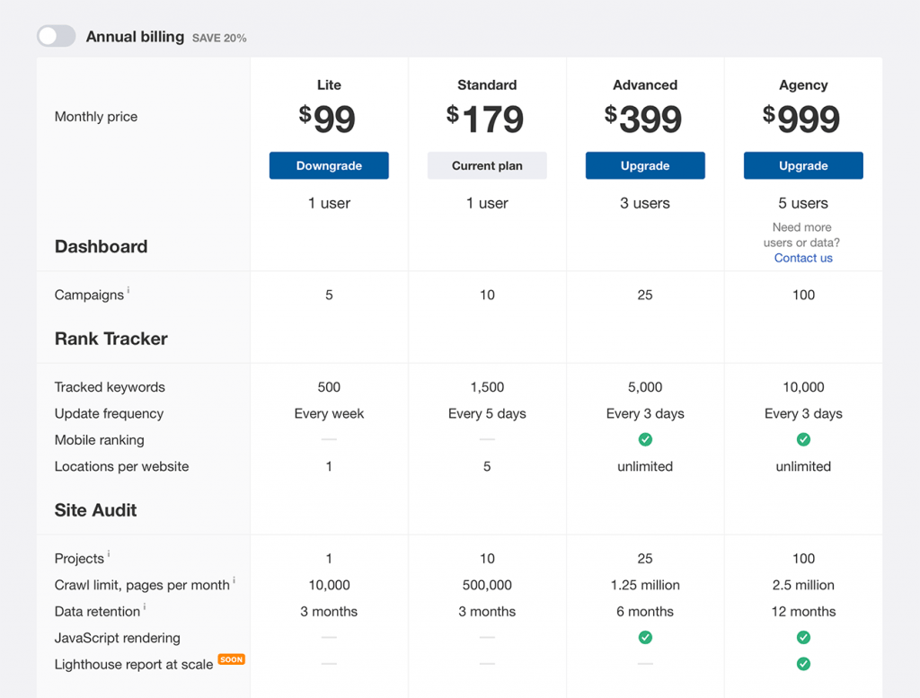
Don't Overload the Table with Redundancies
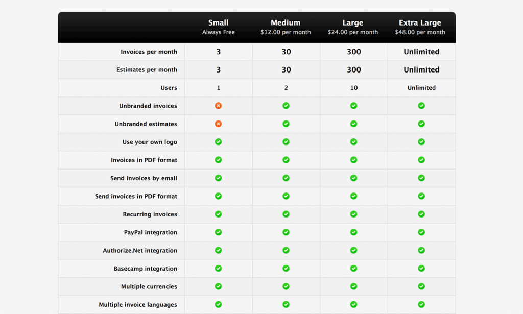
App developers love to tout huge lists of features and a table is definitely a natural and even appropriate way to go about it. However, sometimes designers pack tables with a lot of unnecessary, redundant information that could be presented in a much better way.
Check out the example above from Invoice Machine. The four plans they offer are nearly identical with the exception of three features. This makes for 15 unnecessary rows that leave your eyes jumping back and forth to connect the check marks with the corresponding feature. A simple bulleted list or chart that said "All of our plans include the following features:" would allow users to quickly see that no matter which plan they choose, they get all of these features.
Then the table could be reserved for areas of differentiation, which would cut it down to a much more manageable 3 or 4 rows. Again, let me stress that tables should make the information more readable. If your table isn't meeting this goal then it's counter-productive.
Create Expandable Areas
Another great feature that you can add to your tables is the ability to expand certain rows. This allows you to place a lot of content into a relatively uncluttered space. Pulling this off is pretty simple with a jQuery plugin called jExpand. Here's a tutorial from jankoatwarpspeed on how to implement it.
If you're using an expandable table, just be sure that your headings make it completely clear where to find certain information. The last thing you want is annoyed users, sifting through each section to find what they want.
Highlight Relationships
This is a technique that really increases the readability of a complex table or matrix. The idea is to highlight whatever cell the user is hovering over along with both the column and row that it belongs to. It isn't the simplest thing to pull off, but it's perfectly possible with some clever code. Here's an example of how to do it.
</table>
Well, I'm sure that's more than you ever wanted to know about tables in web design. Use the comments below to let us know your thoughts on the techniques above and be sure to share any unique tables you find!