30 Gorgeous and Versatile CSS Menus
Sometimes the navigation menu can be one of trickiest parts of the design process. This single area can set the tone for the usability of the entire site.
Today we’ll look at 30 inspiring examples of good menu design. Though many are pure CSS, others add in some images and/or JavaScript to increase the aesthetic and functionality.
2 Million+ Digital Assets, With Unlimited Downloads
Get unlimited downloads of 2 million+ design resources, themes, templates, photos, graphics and more. Envato Elements starts at $16 per month, and is the best creative subscription we've ever seen.
Delving Deeper
It’s always more helpful to get a feel for the process of the development than to merely see an image, so in this section we’ll briefly discuss the aesthetic of each menu and how the developer accomplished the effect. This way you can gain inspiration into how to use new methods to create your own unique menus.
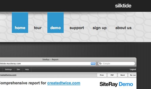
Silk Tide
This is one of the most minimal menus on the list. It’s basically just plain text with an extended blue box rollover but it’s really easy to implement and results in a nice effect.
Glenn Sorrentino
This example uses CSS borders on the top and bottom of the menu that increase in thickness when you hover over them.

Strutta
If you have a textured background, consider using transparency in your menu to increase the aesthetic. This could easily be done with RGBa in CSS3.

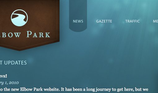
Elbow Park
Another example of transparency in the navigation area. This one uses a similar effect to the first example with the selection box extending up to the top of the page. This increases visibility and makes for a more seamless design.
Thoughtbot
As you rollover these buttons the background changes to a brighter red. This combined with the glossy look (accomplished with a transparent PNG) creates the illusion of the area lighting up.

Toffee Nut Design
This beautiful example uses CSS sprites for the navigation. The entire menu is one PNG showing each of the tabs in three states: off, on, and on+selected.
Safarista
Here we see each section of the navigation as a hybrid of image and text. The icon, gradient and smaller background make each section’s image while the larger text is styled HTML with a underline hover effect.

David Jonsson
Another simple hover effect that bleeds to the top. This one had hidden icons that only display when you mouse over. A nice effect!

Asvalia
I really like the colors and the crooked text on this menu. The glowing rollovers are perfect.
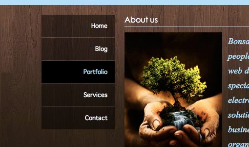
Bonsai Studios
This one is an extremely simple vertical menu with transparency and a darkening hover. It gets the job done, looks great and can be built in minutes.
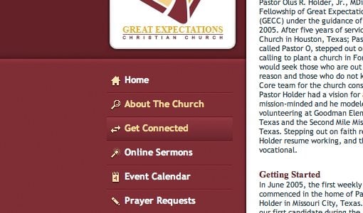
Great Expectations Church
Another vertical navigation menu. This one implements some basic but attractive icons and a background GIF with a gradient for the hover.
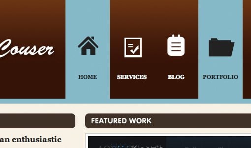
Ryan Couser
This one uses some simple sprites to accomplish the hover. Each icon is an image with both the on and off states.
Kk Media
Here we see a vertical menu with more detailed icons. Each link is an HTML list item with a simple background image applied in CSS.
Bite Club
I really loved this navigation bar. The brightness really grabs your attention and the reversal of the colors makes a perfect rollover. This also uses a sprite for each menu item, each with three states.

Capital City Equipment Company
I though the house shaped navigation selection was clever on this one. The text in each link is part of the image, if you replicate something like this it would be simple just to use live text over the background image instead.

Strawberry Leisure
This dropdown menu uses a small repeating transparent PNG to pull of the reduced opacity effect. Again, we can look forward to this being much easier in the near future with RGBa when more browsers get on board.

Artificial Studio
Yep you guessed it, more image sprites (sensing a trend here?). The big buttons and excellent gradients make for a beautiful navigation area.

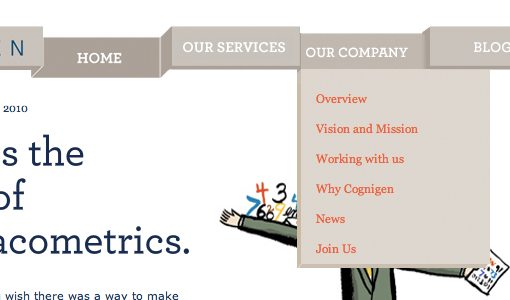
Cognigen
This was by far one of the most original concepts I came across in my search. To pull of the unique 3D effect, the designer has used a whopping four states for each button that change depending on whether the button is selected, hovered over, or has an adjacent selection.
More CSS Menu Goodness
Now that we’ve discussed quite a few great examples, here are a bunch more to check out. Use your browser’s inspect feature to check out the code and images behind any that you like!
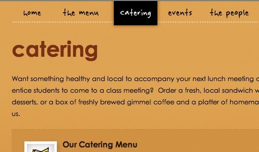
Manndible Cafe
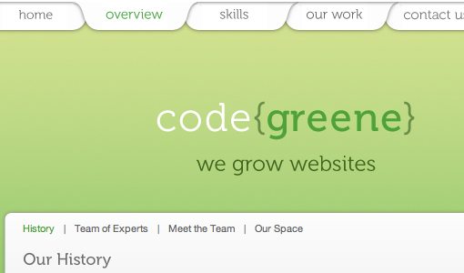
Code Greene
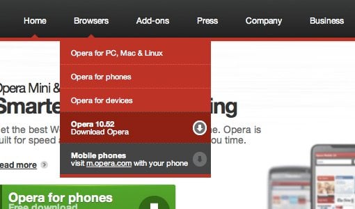
Opera
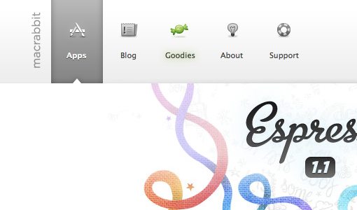
Mac Rabbit
Clark Builders

Mr. B and Friends
Subvert
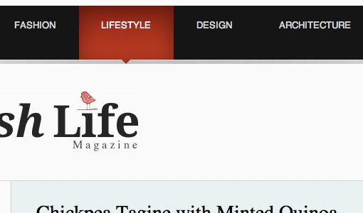
The Swish Life
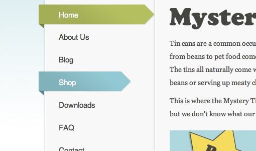
Mystery Tin
LiveResto

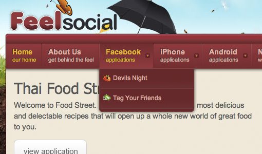
FeelSocial
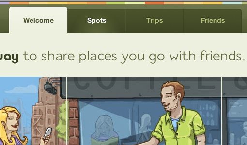
Gowalla
NZ Festival

Download Prebuilt Menus!
Need a good starting point for your own CSS menus? Check out these great free resources.
- 13 Styles: The menus are list based, very light-weight, easy to implement, and cross-browser compliant.
- CSS Menu Maker
- CSS Play: Menus
- CSS Menus
- Free Cross Browser CSS Menus
Now Show Us Yours
Do you have a CSS menu that you’re particularly proud of? Use the comments below and leave a link so we can see. Also let us know which of the examples above you liked best.