Analyzing and Comparing Popular Blog Designs
If you’re thinking about starting a blog, there are a lot of technical details to consider when attempting the initial layout of your page. How large should your text be? What font should you use? Should your images have borders?
We’ll help you answer these questions and more by tearing apart the post designs of popular design blogs. Examining the work of others will give you insight into popular trends and what you think works best. Let’s get started!
2 Million+ Digital Assets, With Unlimited Downloads
Get unlimited downloads of 2 million+ design resources, themes, templates, photos, graphics and more. Envato Elements starts at $16 per month, and is the best creative subscription we've ever seen.
Smashing Magazine
We’ll start by looking at the biggest baddest design blog around. Smashing Magazine has an astounding audience with almost 200,000 of each RSS subscribers and Twitter followers. Needless to say, they’re doing something right.
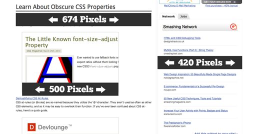
Smashing Magazine post pages are split vertically into two primary columns. The column on the left holds the main content, in other words the posts themselves, and is 674px wide. The column on the right holds auxiliary content such as ads and various links to other pages and sites.
The column on the right always stays the same but the column on the left is fluid and will reduce its horizontal size if the browser window is too small to accommodate 674 pixels.
As you can see in the screenshot above, the page design is solid white with a slight gradient that splits the page vertically between the two columns.
The CSS
One of the best ways to see what’s going on in a web design is to look under the hood at the page’s CSS. Here are a few of the styles implemented on Smashing Magazine.
/*Paragraph*/
p {
color: #1E1E1E;
font-family: Verdana, Arial, Geneva, Helvetica, sans-serif;
font-size: 12px;
line-height: 20px;
width: 674px;
}

/*Post Title*/
h2  {
color: #262626;
font-family: 'Droid Sans';
font-size: 32px;
font-weight: bold;
line-height: 40px;
}

/*Post Headings*/
h3  {
color: #2F2F2F;
font-family: 'Droid Sans';
font-size: 30px;
line-height: normal;
}

/*Images*/
img  {
border: none;
width: 500px;
}
Text Style Analysis
There are a few interesting things going on here. First, Smashing is using a non-traditional web font on their headings (Droid Sans). To accomplish this they’re using @font-face to check locally for the font first, then linking to the Google Font API version of the font for any users that don’t have the font installed.
Using @font-face really opens you up to much more diverse web design possibilities and is becoming more and more common every day. It’s interesting to note that they don’t declare any fallback fonts. It’s often a good idea to build a full font stack just in case the special font doesn’t load for some reason.
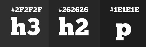
While the headings use Droid Sans, the paragraph copy is Verdana (and contains several fallbacks). We can see that the post title is 32px, the post headings are a 30px, and the paragraph text is 12px.
One item that really grabbed my attention is the text color. Notice that they haven’t used pure black anywhere, but instead a series of really dark grays.
This is actually a good trend to follow as it will be be a lot easier on your readers’ eyes if you avoid using pure black on a page full of text.
Image Style Analysis
There’s a lot less going on with the images than with the text. Smashing keeps their images at 500px wide, with a variable height that changes per image and no border.
Though no border is applied in CSS, occasionally one will be present in the image itself to set it off from the background as in the case of the image shown above. Also notice that the images are indented to the right a bit instead of being placed flush left with the paragraph.
The Design Cubicle
You’ll find that Smashing Mag is one of countless design blogs that use a similar two-column format. Though the design can differ greatly, they’re almost always laid out with content in a wide left column and ads/extra content in a thinner right column.
Rather than looking at more sites that follow this trend, let’s take a look at one that breaks it. The Design Cubicle is the personal blog of Brian Hoff, a graphic designer from Philadelphia. I absolutely love his new site design; it perfectly nails that balance between beautiful and readable.
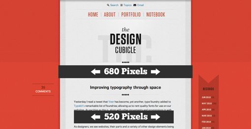
Brian is using a modified single column design with a main div stuck in the dead center of the page and a few extra items on the sides.
The CSS
Let’s take a look at some of the styles used here:
/*Paragraph*/
p {
color: #232D32;
font-family: ff-dagny-web-pro-1, ff-dagny-web-pro-2, Verdana, sans-serif;
font-size: 14px;
line-height: 21px;
width: 520px;
}

/*Post Title*/
h2  {
color: #151515;
font-family: ff-dagny-web-pro-1, ff-dagny-web-pro-2, Verdana, sans-serif;
font-size: 21px;
font-weight: bold;
line-height: 24px;
}

/*Post Headings*/
h3  {
color: #151515;
font-family: ff-dagny-web-pro-1, ff-dagny-web-pro-2, Verdana, sans-serif;
font-size: 16px;
font-weight: bold;
line-height: 16px;
}

/*Images*/
img  {
border: 8px solid white;
-webkit-box-shadow:0px 3px 4px #e2e2e2;
-moz-box-shadow:0px 3px 4px #e2e2e2;
box-shadow:0px 3px 4px #e2e2e2;
}
Text Analysis
Now that we have two to compare we can start looking to see if any possible trends are arising. Semantically, we can see that Smashing Magazine and The Design Cubicle are both using h2 tags for the post title and h3 tags to divide the post into sections. Also, again we see that neither the paragraph text or the headings are pure black and even differ from each other as with Smashing. Finally, we see another custom font being loaded via @font-face (the actual @font-face snippet isn’t shown above), this goes further to show that it really is becoming a common practice. Notice that Brian has included some fallback fonts as well, like I recommended above.
The font size is a little larger here but keep in mind that he’s using a different font than Smashing. It’s a decent rule of thumb to hover around 12-16 pixels, just feel it out with whatever font you go with and decide what looks best. Also be sure to assign a line-height that provides strong readability.
Another bit of CSS3 we see Brian using is in the text links on the page. Here’s the CSS for these:
p a {
color: #4083A9;
}

p a:hover {
color: #232D32;
}

a {
text-decoration:none;
-webkit-transition:all 0.3s ease-out;
-o-transition:all 0.3s ease-out;
-moz-transition:all 0.3s ease-out;
}
As you can see, rather than simply letting the hover change the text color immediately, he uses CSS3 transitions for webkit, Opera and Mozilla to fade the link from one color to the next. Any browsers that don’t support these commands will still see the link change color, they just won’t see the transition effect.
Image Analysis
Surprisingly, Brian rarely uses any images at all in his posts. However, when he does use images, we see a nice thick 8px white border to set them off from the background and an ever so subtle shadow.

As with the transitions, notice that he implements the CSS3 shadows with all the popular solutions for various browsers and that the shadow isn’t critical to the visibility of the item, meaning everything will look fine in browsers that lack support.
Information Architects
The last blog we’ll look it is that of Information Architects, a seven person design team split between Tokyo and Zurich. The IA blog is extremely attractive with large, easily readable typography and a unique layout that puts the main column just right of center.
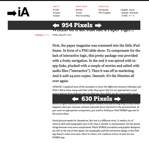
As with the other two blogs, the main content area is between 600-700 pixels wide. This seems to be a good range that gives you plenty of line length without getting too carried away. We also see a total width of around 960 pixels for both The Design Cubicle and IA, as you know 960 is an extremely popular width in web design thanks to the 960 grid system.
The CSS
Let’s take a look at some of IA’s styles and compare them what we saw in the other blogs:
/*Paragraph*/
p {
font-family: Georgia, 'Hiragino Mincho Pro', serif;
font-size: 16px;
line-height: 24px;
width: 630px;
}

/*Post Title*/
h1  {
font-family: Georgia, 'Hiragino Mincho Pro', serif;
font-size: 32px;
font-weight: normal;
line-height: 32px;
}

/*Post Headings*/
h2  {
font-family: Georgia, 'Hiragino Mincho Pro', serif;
font-size: 24px;
font-weight: normal;
lline-height: 36px;
}

/*Images*/
img  {
border: none;
width: 625px;
}
Text Analysis
Here for the first time we see a standard web font (Georgia) being used uniformly throughout the site. The same font stack is used for the post title, headings and paragraph copy with no bold variation and the only difference being size and line height.
We also see the largest typography yet, with a 32px post title, 24px headings and 16px paragraph text. This works beautifully on this site as Georgia is a very attractive and professionally designed typeface. The old-style serif font gives you the feeling of reading newsprint or a book and is often regarded as easier to read than sans-serif faces for large blocks of text.
Unlike the previous two sites, here h1 is used for the post title and h2 is used for the post headings. The h2 tag is also applied to the entire first paragraph of the post for a strong visual opening. Also different is the lack of a color applied to the text (at least that I could find). This will default to pure black rather than the lighter blacks and grays we saw on the other sites.
Links (not show above) on the IA blog are underlined and red (#C00) and become solid black on hover.
Image Analysis
There’s nothing too noteworthy about the image styles here. As with Smashing, there is no border or shadow applied through the browser.
However, the visual presentation of the images is quite different than we’ve seen elsewhere.
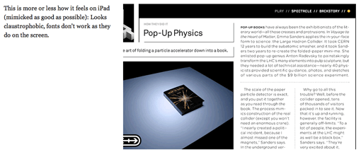
Each picture is accompanied by a description placed near the top left of the image. This makes nice use of all that empty space on the left and also creates some really nice visual dividers for different portions of the article if you’re browsing rather than reading. It’s important to remember that with blogs it’s likely that the majority of your readers will be merely skimming the article. For this reason blogs like IA, Smashing Magazine, Six Revisions, and even Design Shack often bold the text of various important statements throughout the post.
Closing Thoughts
It’s obviously impossible to identify true trends with such a small sample, but I tried to give a good spread of three very different post designs so you can see that even among diverse designs, many similarities arise.
Also notice that I chose two out of three of these blogs because their post structure was fairly unique. There were easily a hundred design blogs on my list that used nearly identical layouts. There’s a strong argument to follow this trend: users know what to expect and are familiar with the format, it’s effectiveness has been proven, etc. However, never be afraid to break the mold. Analyze your particular goals and design style and decide what’s right for both you, and more importantly, your readers.
Leave a comment below and tell us what you thought of the article. Also leave a link to your own blog and tell us a little about your design and how it’s similar/different that those above.