How to Use the New Google Font API
Today we’re going to learn about what the new Google Font is and how to implement it right away in your designs.
It’s free to use and can be installed in under a minute once you get the hang of it!
2 Million+ Digital Assets, With Unlimited Downloads
Get unlimited downloads of 2 million+ design resources, themes, templates, photos, graphics and more. Envato Elements starts at $16 per month, and is the best creative subscription we've ever seen.


Introduction
In the past year, there has been quite the explosion of options for implementing custom fonts on the web. Everyone knows the future of web typography is bright but no one knows exactly what the outcome will be.
Several companies have rightfully seen this budding technology as a way to make some cash. We’ve recently had an in-depth look at a few of the options available in this arena. Our articles on TypeKit and FontDeck show that these solutions are quick, easy and not altogether that different. These types of services will no doubt continue to provide tons of premium fonts at affordable prices for some time.
However, if you take a look at the really popular technology on the web, you’ll see a trend emerge: free. HTML, CSS, JavaScript, PHP, these don’t cost a dime to use. It’s therefore reasonable to think that the real future of web typography lies in a free solution that can be used by the masses with no strings attached.
A Game Changer?
Obviously, when Google throws its hat into any ring, it has a tendency to change everything. Recently, Google (in conjunction with Typekit) quietly launched a webfont API that could result in just such a long-term shift. While other companies are setting up memberships, payment plans and subscriptions, Google decided to forgo a members-only service completely in favor of providing a free and easy way for any web developer to quickly load custom fonts into a web design.
To see how it all works, let’s dive into a quick example. Before we get started, here’s a quick preview and live demo of what we’ll be building.
The HTML
To increase the fun, let’s use HTML5 and CSS3 along with Google’s font API. That way we’ll really get a decent glimpse into the possible future of web design! Keep in mind that there are still some browser compatibility issues with these technologies. So if you’re using a sucky browser, just know that your experience will be scaled back a bit, but should degrade just fine.
The Starter Code
To start off, paste in a blank HTML5 code snippet.
<!DOCTYPE html> <html> <head> <meta charset=utf-8 /> <title>Design Shack Google Font API Test</title> <link rel="stylesheet" media="screen" href="style.css" /> <!--[if IE]> <script src="http://html5shiv.googlecode.com/svn/trunk/html5.js"></script> <![endif]--> </head> <body> </body> </html>
This is a modified version of a starter file I found on Snipplr that contains a JavaScript hack to help good old IE along with HTML5.
The Divs
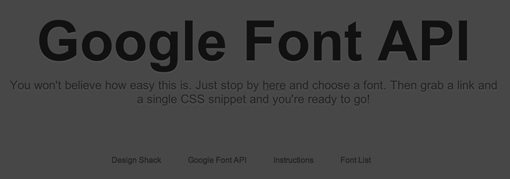
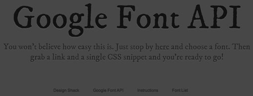
We’ll keep the page super simple and include only a headline, subhead copy, and a simple footer. This will give us three unique areas to play with. We’ll use these areas to implement two different fonts from the Google API.
<body>

    <div id="container">

	    <div id="headline">
	    	<h1>Google Font API</h1>
	    </div>

	    <div id="subhead">
	    	<p>You won't believe how easy this is. Just stop by
	    	<a href="http://code.google.com/webfonts">here</a> and choose a font.
	    	Then grab a link and a single CSS snippet and you're ready to go!</p>
	    </div>

	    <footer>
	    	<ul>
	    	<li><a href="https://designshack.net/">Design Shack</a></li>
	    	<li><a href="http://code.google.com/apis/webfonts/">Google Font API</a></li>
	    	<li><a href="http://code.google.com/apis/webfonts/docs/getting_started.html">
	    	Instructions</a></li>
	    	<li><a href="http://code.google.com/webfonts">Font List</a></li>
	    	</ul>
	    </footer>

    </div>

</body>
As you can see, I’ve used a h1 tag for the headline, a p tag for the subhead, and the HTML5 footer tag for the footer. For the latter I’ve thrown in an unordered list of links just to have something down there. Feel free to completely change any of this if you’re following along as it doesn’t really matter what you insert as long as you’ve got some copy.
At this point, you should have something basic and ugly like in the screenshot below.
That’s all the HTML we’ll need! Let’s jump over to the CSS.
The CSS
For the CSS, I chose to implement a nice letterpress effect inspired by this Line25 CSS3 tutorial. On browsers that don’t support text-shadow, the text will still be perfectly readable and should maintain the Google webfont.
Basic Styles
First we’ll implement a super basic CSS reset and throw in a background color.
* {
  margin: 0;
  padding: 0;
}

body {
  background: #474747;
}

#container {
	width: 1000px;
	margin-left: auto;
	margin-right: auto;
	margin-top:  100px;
}
The Headline
Next throw in some styles for the headline. We want a font color that’s darker than the background and a shadow color that’s lighter than the background to create that nice letterpress illusion.
#headline {
	width: 1000px;
	margin: auto;
	margin-bottom: 10px;
}

#headline h1 {
	text-align: center;
	font-size: 8em;
	color: #111;
	text-shadow: 0px 2px 3px #555;
}
Notice that we also centered the div and the text. I usually avoid centered web layouts for several reasons but this is merely to show off some text so a centered div works perfectly. If you don’t like it, feel free to left align your text.
The Subhead
Next up is the subhead or paragraph copy. We’ll style this essentially the same way as the headline only smaller.
#subhead {
	width: 1000px;
	margin: auto;
}

#subhead p {
	text-align: center;
	font-size: 2em;
	color: #222;
	text-shadow: 0px 2px 3px #555;
	margin-bottom: 100px;
}

#subhead a {
	color: #222;
	text-decoration: underline;
}

#subhead a:hover {
	color: #888;
	text-shadow: 0px 2px 3px #111;
}
Notice that we’ve also thrown in some link and hover styles. When the user hovers over a link, it will become a lighter color and the letterpress effect will become a normal shadow.
The Footer
Finally, we’ll turn our unordered list into a horizontal line of evenly-spaced copy.
footer {
	width: 500px;
	margin: auto;
	text-align: center;
	font-size: 1em;
}

footer a {
	color: #222;
	text-decoration: none;
}

footer a:hover {
	color: #888;
	text-shadow: 0px 2px 3px #111;
}

footer li {
	display: inline;
	list-style-type: none;
	padding-right: 25px;
}
Here I’ve applied link and hover styles similar to that of the paragraph copy and added some padding to space out the links.
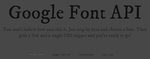
Pre-font Preview
Notice that I’ve intentionally left out any font-family references. That’s because in our next step we’ll insert some of the fonts from the Google API. For now your page should look something like the screenshot below. Keep in mind that your fonts will likely differ based on the defaults in your browser.
As you can see, our letterpress effect is working just fine. It’s subtle but makes the text look a little nicer.
Adding Fonts with the Google Font API
Now that we’ve got a basic page to play with, it’s time to load some fonts in! First stop by the Google Font API page and click on the Google Font Directory.
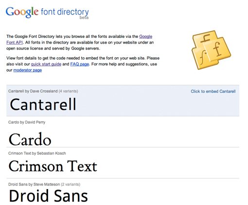
Here you’ll see a brief list (currently 18) of fonts to choose from. Each font has several variants and sub-families to choose from. When you find one that you like, click on it to see the additional options. I’m going to choose “IM Fell” and the first family under this font (IM Fell DW Pica).
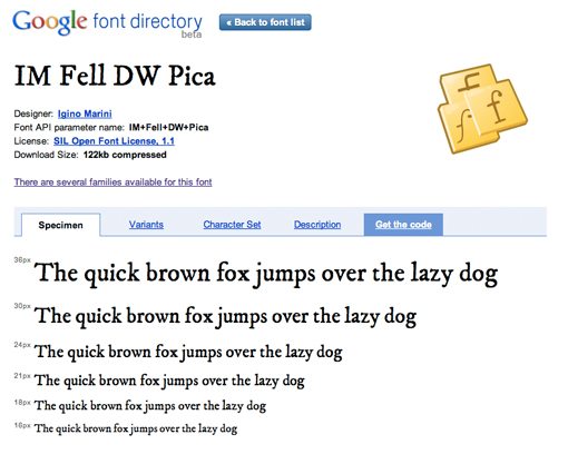
When you get to the screen above, click on the “Get Code” tab. Under this tab you’ll find the code snippets you’ll need to insert the font into your web page. There are two ways to import the font: by linking in the head section of your HTML or by using an @import statement. We’ll use both to get a feel for how they work.
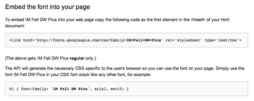
Method 1: Head Link
First, grab the snippet of code that looks like the one below and paste it into the head portion of your HTML page.
<link href='http://fonts.googleapis.com/css?family=IM+Fell+DW+Pica' rel='stylesheet' type='text/css'>
Now copy the CSS snippet and paste it into your the headline and subhead sections of your stylesheet.
#headline h1 {
	text-align: center;
	font-size: 8em;
	color: #111;
	text-shadow: 0px 2px 3px #555;
	font-family: 'IM Fell DW Pica', arial, serif;
}
That’s it! Just two copy and paste actions and you’ve got yourself a fancy new webfont.
Method 2: @Import
Now for the footer font, we’ll repeat the same process with one change. Find the font “Inconsolata” from the Google Font list, go to the “Get Code” tab and look under the “Font variants and advanced techniques” section for the following snippet:
@import url(http://fonts.googleapis.com/css?family=Inconsolata);
Simply paste this into the very top of your CSS page, then copy the font-family CSS snippet and paste it into your footer section.
footer {
	width: 500px;
	margin: auto;
	text-align: center;
	font-size: 1em;
	font-family: 'Inconsolata', arial, serif;
}
Voila! Now your footer should contain the Inconsolata font.

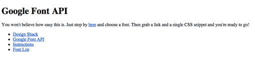
Final Preview
Now that we’re all done, have another look at the final preview to see it in action. Click the image to see the live demo.
For some more advanced control over font loading, check out the WebFont Loader, a JavaScript library provided by Google to help you tweak the process.
Pros
Needless to say, this is the single fastest and easiest webfont solution I’ve come across. I know I said that in previous articles, but these things just keep getting better and better! The lack of a sign up process is a real time saver for the Google system. Further, since you don’t have to go through the mess of registering specific domain names to license the fonts for, you can even test them locally in your development process! This seamless integration into my current workflow was a huge kicker for me as I hated developing locally with the wrong font and applying the custom font on the live page.
Like just about all of the popular webfont solutions, Google’s system is using @font-face to get the job done. So why not just do it yourself? Chris Coyier points out three main benefits in his article on the Google Font API: “Bandwidth savings (weight is on Google), Caching speed (same font used on multiple sites, browser cache kicks in), and Speed in general (Google’s CDN is faster than your site).”
So essentially it boils down to speed speed and speed! Just one side technical note in case you’re wondering: all of the text is fully selectable and copies/pastes very well. I hate it when custom fonts are selectable on a site but don’t copy correctly!
Cons
One of the biggest downsides is that there are currently very few fonts to choose from, which can really limit your designs. For instance, I was originally going to use a nice flowing script, but hated the two choices Google gave me.
Keep in mind that this system is still very new so you can expect to see it grow much larger as new free fonts are added. However, you’ll probably never see the quality and diversity here that you’ll get from a premium option like FontDeck or TypeKit.
Further, as the guys at FontSquirrel pointed out in a recent tweet, there is no SVG version of the font provided, meaning you’ll have to make your own if you want iPhone/iPad support.
My final complaint is that there are definitely some noticeable kerning issues with a few of the available fonts (again, keep in mind that they’re free). I’m a print guy so these really make me cringe. They’re probably possible to fix with CSS, it’ll just be a bit tedious and annoying.
Conclusion
The Google Font API represents yet another chapter in the story of @font-face methods for creating more diverse typography on the web. Though the font choices are currently limited, this is definitely the best implementation I’ve tried yet as it is just so quick and easy.
The ability to forgo a signup process and test locally without the headaches of specific domain registration are real winning features for me, but I’d love to hear what you think? Do you like Google’s system and if so will you use it? Use the comment section below to share your thoughts.