Rolling Your Own Grid Layouts on the Fly Without a Framework
Do you hate CSS grid frameworks but love the rapid layout benefits that they provide? Do you struggle with the math and code necessary to create your own flexible multi-column layouts on the fly?
Today we’re going to walk you through creating your own basic, reusable system for creating multiple columns that you can implement anywhere any time with only a few lines of code. No bloated code or non-sematic class names required!
2 Million+ Digital Assets, With Unlimited Downloads
Get unlimited downloads of 2 million+ design resources, themes, templates, photos, graphics and more. Envato Elements starts at $16 per month, and is the best creative subscription we've ever seen.


Grid Frameworks: Pros and Cons
I’m a pretty big fan of CSS grid frameworks. I love downloading them, breaking them open and seeing how they tick. I’ve written about nearly every good one that I can find here on Design Shack and I’ll likely continue to do so in the future.
The benefit of grid frameworks is a no-brainer: they make for ridiculous fast layout. If you have a pretty straightforward layout in mind for your site, you can bust it out effortlessly and spend more time enriching your design than struggling with how to make your columns work.
However, CSS grid frameworks have some pretty serious downsides as well. For starters, many of them are quite hefty and go well beyond simple layout classes while seeking to extensively style every default HTML element the world has ever seen, no matter how obscure. This size problem can definitely tend to make the frameworks difficult to wrap your mind around.
Grid frameworks are also fairly fixed. You have to play by their rules or you end up breaking the entire thing. Customizing the code to your own liking can be a long and painful process, which sort of defeats the time-saving idea.
Finally, many coders are real sticklers for semantic code and setting up generic, obscurely-named classes for layout really frustrates them to no end!
Build Your Own
As we just clearly laid out, some people love CSS grid frameworks, many absolutely hate them. This article is targeted at the coders that are somewhere in between the two. You like the benefits that you get, such as rapid layout of multiple columns, but you’re not convinced that these things are really worth all the trouble.
This is especially true for those constructing a fairly simple web page. Sure, it would be nice to have some help with the layout but bringing in an entire framework for a single page is like bringing in a backhoe to plant a sapling.
For these types of projects, it may be better to abandon grid frameworks altogether. However, it may still behoove us to have some sort of system in place for busting out multiple columns on the fly.
The goal here is to set up a reusable system that you can implement to accomplish complicated, multi-column layouts. The system must be concise and not suffer from bloated code. It should not require a huge list of non-semantic classes, many of which you may never use. It should also be flexible and bend to your will with each project rather than backing you into a corner. If you change your mind and suddenly alter the entire width for the site, our grid should reflow itself with zero problems. Finally, implementation should be quick and painless.
Creating Columns in CSS
If you’re just starting out in CSS layout, building a multi-column layout might be a little bit intimidating. Obviously, if it were effortless, we wouldn’t have so many frameworks that seek to simplify the process!
Let’s say you want to set up four columns. First you have to take your width into account. Let’s say you have a 900px wide container. If you divide 900px by four columns you get 225px per column. Pretty simple! However, these columns will all smash up against each other, we need some margins. Unfortunately, margins will bust our layout and expand our columns beyond the parent width.
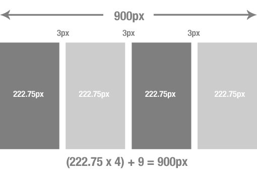
What we need to do then is figure up the total amount of room needed for margins. Let’s say we want the first, second and third column each to have a margin-right of three pixels. Three pixels times three columns equals nine pixels for margins. Now we simply take nine from our width (900 – 9 = 891) and then divide by four columns to come up with 222.75px for each of the four columns.
Huh?
This obviously involved a little bit of math on our part. It’s not exactly college level stuff but it’s also not fun to do this every time we need a few columns (the math is also pretty ugly). Further, as soon as we change the total width of our container, this entire thing breaks and we have to start over!
So how do we make it so that when the parent changes, the children follow?
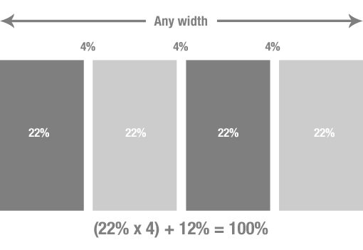
Use Percents Instead
Pixel values are case-specific and too precise to use on something that we want to be recyclable. If we substitute percents, our math becomes easier and our grid will be smart enough to adapt to a changing parent container. Essentially, we’ll be building a fluid grid.
Create a Grid Calculator
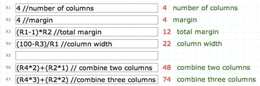
If we want fast implementation, we can’t be thinking over all this complicated math every time! Instead of running all of these numbers in our heads, let’s set up a tool to do all the work for us. It’s pretty simple with a tool called Instacalc.
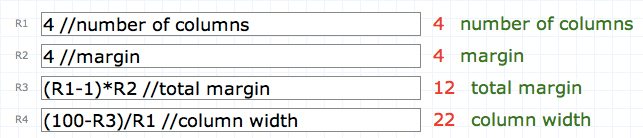
Instacalc is pretty much a fancy calculator with some minor spreadsheet capabilities. What we get here is the ability to set up reusable formulas for figuring out our columns system. You only have to do this once mind you, once we set it up the first time, you can save the calculator and come back whenever you need it!
Here’s the setup that I used. The first field requires you to input the number of columns and the second asks for a margin value (this will be in percent). The rest is automated to give you the results that you need. The third field figures out your total margin and the fourth tells you the column width that you need.
If you don’t want to set this up, don’t bother! Just use mine. With this in place, we can easily calculate the widths needed for the four column layout we attempted above.
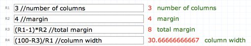
Now, if we want to change to a three column layout, all we have to do is type “3” in the first field of our calculator. The rest is taken care of for us. This takes all the work out of figuring out multi-column layouts. Simply input a number for your columns and a number for your margin and you get everything you need. Sometimes you get some sloppy numbers as a result, but honestly I’ve found that there’s absolutely no problem with setting your columns widths at “30.667%”.
Build It!
Enough theory, let’s build this sucker. All of the stuff above sounds like a ton of work, but honestly it’s way more work to explain it than to build it!
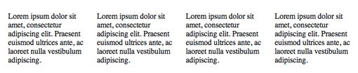
Let’s say we want four columns of text explaining four features on our website. The HTML for this is pretty easy, just create a wrapper for the section as a whole and a div for each column. I also threw a “last” class on the last column to help us clear the margin.
<div class="wrapper">

<div class="featuresColumn">
    <p>Lorem ipsum dolor sit amet...</p>
</div>

<div class="featuresColumn">
    <p>Lorem ipsum dolor sit amet...</p>
</div>

<div class="featuresColumn">
    <p>Lorem ipsum dolor sit amet...</p>
</div>

<div class="featuresColumn last">
    <p>Lorem ipsum dolor sit amet...</p>
</div>

</div>
Now for the CSS. First, we set a width on the wrapper and set the overflow to hidden. Next, we simply style the features class with the math that our calculator spits out. It’s important to note once more that since we have this calculator already set up, we don’t have to run a single calculation in our heads. Just type in the values and grab what the calculator gives us.
.wrapper {overflow: hidden; width: 600px;}
.featuresColumn {float: left; width: 22%; margin-right: 4%;}
.last {margin-right: 0;}
See how little code this is? In place of a gigantic framework we have a few simple declarations that anyone can read. The result is a nice little four column layout that adjusts perfectly to any scenario.
From here we can change our width to anything we want and the grid will fix itself. Want to switch to 960px wide? Simply change the width of the wrapper.
.wrapper {overflow: hidden; width: 960px;}
.featuresColumn {float: left; width: 22%; margin-right: 4%;}
.last {margin-right: 0;}
If you want a nice fluid grid, change the width of the wrapper to a percent. Now as you adjust the browser size, your columns will automatically adjust.
.wrapper {overflow: hidden; width: 90%;}
.featuresColumn {float: left; width: 22%; margin-right: 4%;}
.last {margin-right: 0;}
Combining Columns
The clever among you are already saying “not so fast”. The problem we’ve run into from here is that our columns all have to be the same width. For example, what if we want to combine the last two columns of our layout into one wide column?
All we have to do for this is set up a formula in Instacalc that combines two columns and takes away the margin of one of them. Like the rest, this is a one-time thing that you can use again and again. Here I made one formula for combining two columns and one for combining three.
The Code
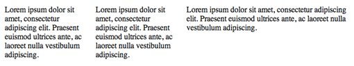
The HTML for this is exactly like last time, only we have three columns instead of four.
<div class="wrapper">

    <div class="featuresColumn">
        <p>Lorem ipsum dolor sit amet...</p>
    </div>

    <div class="featuresColumn">
        <p>Lorem ipsum dolor sit amet...</p>
    </div>

    <div class="featuresColumnWide last">
        <p>Lorem ipsum dolor sit amet...</p>
    </div>

</div>
Once again, we just plug in the numbers from our calculator and we get a nice, concise chunk of CSS that accomplishes exactly what we need it to.
.wrapper {overflow: hidden; width:700px; margin-bottom: 3%; }
.featuresColumn {float: left; width: 22%; margin-right: 4%;}
.featuresColumnWide {float: left; width: 48%; margin-right: 4%;}
.last {margin-right: 0}
Here’s the resulting layout with the last column being twice as wide as the first two. Using this method you can slice and dice up an endless combination of different widths that you can apply across all different sections of your site.
Play With It
I definitely encourage you to jump into this code and get your hands dirty. I’ve set up a live playground over at JSFiddle for you to see these examples live and edit them to your own liking.
Conclusion
We had a number of various goals when we started this project. We set out to build a basic grid system that is flexible enough to be implemented in a container of any width, even if that container changes size. The CSS had to be extremely brief and allow for semantic class naming. Finally, implementation had to be fast.
Though it’s definitely a bit complicated to wrap your head around at first, our system accomplishes all of these goals. You may argue that there’s way too much math to call it easy but in truth I’ve given you the formulas and the saved calculator that you need. The only work necessary on your part is to input two numbers each time you want to create a new layout!
This article is by no means a recommendation that you should always use this system to build multi-column layouts. It’s merely an attempt to show you that you don’t have to be dependent on someone else’s complicated and bloated framework. With a little bit of setup and ingenuity, multi-column layouts can be accomplished on an as-needed basis with very little effort!