Design Critique: Blog Platforms

Most designers are familiar with the relative pros and cons of different publishing tools – but what about the websites of the blog platforms themselves? We all know that you shouldn’t judge a book by its cover, but I would argue that there’s no harm in looking…
We’re going to take a look at the homepage for four popular platforms: WordPress, Textpattern, ExpressionEngine and Blogger. Which ones are beautiful enough to compel you to use their platform, and which ones have the design aesthetic of a hello kitty toaster? Hopefully through a critique of these designs you can take home some good pointers for use in your own work.
2 Million+ Digital Assets, With Unlimited Downloads
Get unlimited downloads of 2 million+ design resources, themes, templates, photos, graphics and more. Envato Elements starts at $16 per month, and is the best creative subscription we've ever seen.
WordPress

The WordPress homepage has recently gone through a complete re-design for the release of version 2.5 of the software. Whilst the site does have a huge amount of content, the homepage is simple and easy to read.
What works:
- The use of orange to highlight download links makes the task that most people visit the site for a simple one
- The style of language – “WordPress is both free and priceless at the same time” is a great sentence.
- It makes WordPress understandable to someone who has very little knowledge of technical aspects. The words PHP and MySQL are not even mentioned!
- Form input fields have been painstakingly designed
What doesn’t work:
- The WordPress for Dummies image in the bottom corner clashes with the colour scheme
- The fact that the site ironically doesn’t seem to be powered by WordPress
Textpattern

Textpattern is the most basic of designs and does not go a very long way to ‘selling’ itself to potential users. However, with all the focus being placed on textual content it does live up to it’s name. We use Textpattern to publish certain sections of Design Shack and we’re more than happy with it!
What works:
- Splitting the layout using only text columns screams professionalism
- A subtle use of yellow defines the Textpattern ‘brand’
- The requirements and interface features are quickly found
What doesn’t work:
- The site is focused towards the technically minded
- There is no emphasized area of text which introduces the software
- Screenshots are displayed in a fairly flat and uninteresting manner
- The download link is tricky to see
- The amount of content on the page is excessive, overloading visitors a little too quickly
Blogger

Blogger differs from the other platforms we are analysing as it is a hosted service. Powered by Google, it allows completely non-technically minded people to start publishing a blog with great ease.
What works:
- Content is kept simple with a minimum of technical information
- The ‘3 easy steps’ idea easily guides the user through a straight forward process
- Branding is used well, imprinting the Blogger logo on the readers mind
What doesn’t work:
- The use of typography is confused, with too many different effects, colours and faces
- The site lacks professionalism, clearly focused towards a certain user group
- The icons look decidedly dated
- Tables are used for layout in certain areas which really should be styled with CSS
Expression Engine
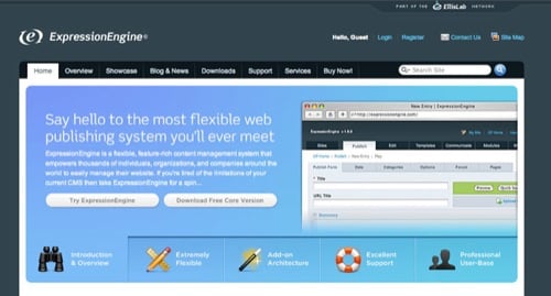
As the only commercially sold platform in this analysis, Expression Engine has a different motive to persuade publishers to use their software. This leads to a design more reminiscent of other commercial software sites.
What works:
- A professional, well designed colour scheme
- The use of tabbed content on the homepage to show a greater amount of information in a visually appealing way
- The website is powered by Expression Engine itself
- Unlike Blogger, the icons and graphics used and professional and well crafted
What doesn’t work:
- The bold logo for the testimonial section immediately draws the eye – away from the main Expression Engine logo
- Due to the heavy graphical nature of the page, loading time is slightly longer than the other designs
Lessons to take away
- From WordPress: Place emphasis on the most important reason the user came to the site, in this case, to download the software
- From Textpattern: Too much information can overload the reader, and a brand can be created using a single line of colour
- From Blogger: Guide the user through a process
- From Expression Engine: Using a dynamic area can allow more information to be conveyed without overloading the user at first
We hope you enjoyed this “design analysis” concept and found it to be useful. Please feel free to give your two cents on the above designs in the comments.