5 Logo Design Lessons From Fast Food Joints
Few logos have the power to immediately draw forth feelings from us more than those of fast food restaurants that we’ve seen and eaten at for decades. Just the sight of those golden arches can bring a smile to the face of children and adults alike.
What makes these logos effective and how can you put these ideas into practice in your own work? Today we’re going to see what we can learn by exploring the logos of several famous American fast food restaurants.
2 Million+ Digital Assets, With Unlimited Downloads
Get unlimited downloads of 2 million+ design resources, themes, templates, photos, graphics and more. Envato Elements starts at $16 per month, and is the best creative subscription we've ever seen.
It’s OK to Be Obvious
Sometimes we put far too much pressure on ourselves to come up with a clever or witty logo. We spend hours trying to think of a way to create a visual double entendre or to infuse some hidden meaning in the imagery.
It’s true that your first idea is often your most generic, but in the case of logos, that’s not always the worst thing in the world. Taking a concept literally often makes for a very effective and memorable icon.
For example, consider the two logos below. It might seem painfully obvious to use a domino for Domino’s Pizza and a white castle image for White Castle, but in reality that’s exactly what these brands need.
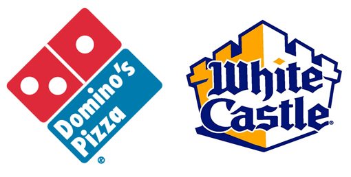
Notice that no time has been given to trying to make the domino look like a “d” or to turn the castle into a burger, these are just straightforward representations of the items in the company names.
Give Your Brand a Friendly Face
Marketers and designers have long known the benefits of anthropomorphizing a company. By putting a smiling face to your brand, you make it more friendly, approachable and memorable.
KFC might be a purveyor of obesity in a bucket, but how could you not love the friendly Colonel Sanders? And how could you resist a tasty Frosty from the innocent pigtailed Wendy?
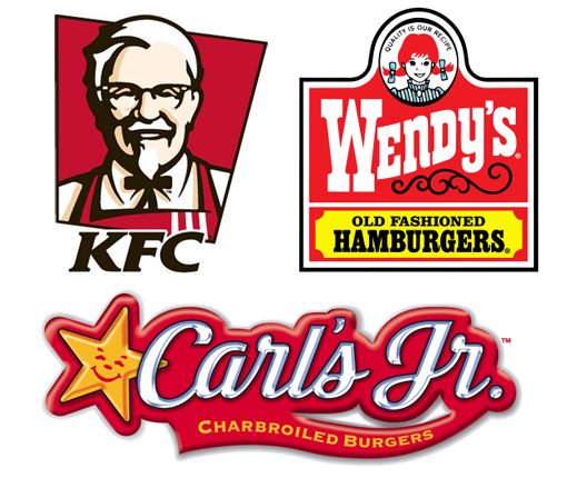
The Colonel is an awesome full-blown human illustration, which isn’t easy for designers who aren’t particularly great with sketching. However, the Carl’s Jr. Star proves that you don’t have to be the best artist to create a widely recognizable mascot!
A Tagline Goes A Long Way
When you’re designing a logo, especially if it’s your own, it’s too easy to assume that everyone shares your knowledge of the brand and/or company. It’s often the case that you need to communicate a lot about the company in the logo, otherwise the viewer won’t know what you’re all about.
Businesses almost always have a brand slogan or tagline that effectively communicates the heart of their goals. Incorporating this into the logo makes for extra work, but can really help customers identify with the brand.
As an example, consider the logos for Subway and Quiznos. Both are fast food sub sandwich places, but if you’ve ever eaten at them then you know that they are very different in their menu offerings. They each try to communicate this in their logo with a tagline:
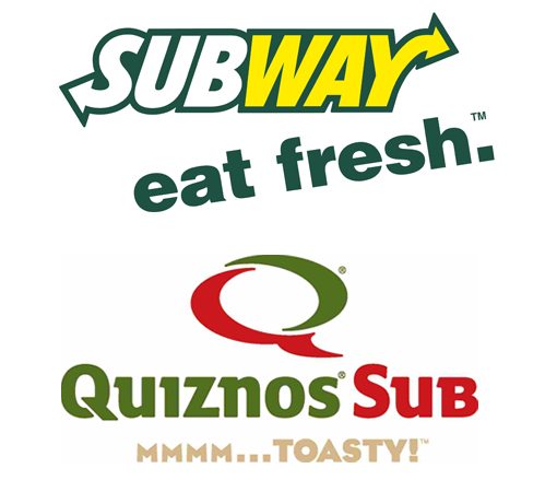
Subway is more lunch meat and veggie focused and emphasizes fresh, healthy ingredients with a simple statement: “eat fresh.” Quizno’s on the other hand possesses many more hearty, savory and likely less healthy subs that are toasted in a much better oven than the one that Subway has recently adopted as a response. The emphasis here is on the flavor and the fact that the subs are cooked: “MMMM…TOASTY!”
Upgrade Gracefully
Major logo overhauls have had a rough time with consumers recently. The Gap is one of many companies that famously tried to modernize their branding only to tuck their tail and revert to the old design as consumer outrage reached a boiling point on social media sites.
People really connect with brands in deep and even emotional ways. They often don’t even realize it until something is changed and they immediately miss the way things were before. Complaints come with any changes, but with minor upgrades, people come around a lot quicker and soon forget the old logo even existed.
However, when you drastically change the entire personality of the brand, as Gap attempted to, the effect is multiplied and what is normally a minor annoyance becomes something that people feel they need to act on. Admittedly, sometimes such projects are met with widespread acceptance but when you’re working with an established brand that’s easily recognizable to millions of people, sometimes incremental upgrades can save you a lot of headaches.
Consider the two logo upgrades shown below. Notice that, in both cases, the integrity of the original design is maintained. The same basic idea is in place, it’s just evolved.
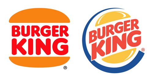
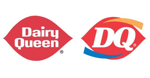
It’s hard to describe, but the newer versions of the logos still “feel” like the same brand. One glance and you can instantly tell that these are the same restaurants you’re familiar with.
Scrapping Subtlety
It’s important to note that not all fast food places take this route. Jack in the Box recently underwent a complete redesign of their logo.
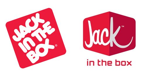
Since the change was drastic, it was met with mixed reviews. Some loved it, others absolutely hated it. Fortunately for Jack, the new version turned out to be cool enough that we’ve all just accepted it at this point. It helps that the redesign didn’t fall into the “just type it in Helvetica” trap like so many other logo design projects these days.
The lesson here: if you want to completely change a long-held logo, you better be dang sure that your new idea is a great one!
You May Need Multiple Versions
When you’re designing a logo for a client, one of the most important things to keep in mind is how it will be used in the real world. Will it primarily be used in digital, print or both? Will it view correctly on a billboard and a business card? What if the circular logo needs to go into a horizontal space?
Professional logo designers have learned that with logos, it’s not always the case that one size fits all. You need to consider giving your client a black and white version and a color version, a print version and a web version, etc. to prevent them from calling you every three weeks with a new request.
In the case of the two logos below, shape was obviously a major concern. Both logos have a fairly long horizontal version, but these really don’t work well in all design situations so alternate versions were created to fit into smaller spaces.
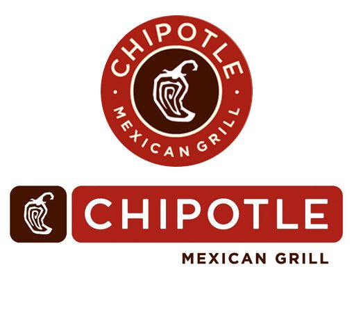

Notice that you’re not creating multiple distinctly unique logos. Instead, you’re simply taking the essence of the original and attempting to accommodate alternate design scenarios. Often, you’re already torn between two layouts anyway and this allows you to utilize the merits of both. Just make sure that the various versions are so similar that customers won’t be even a little confused.
Conclusion
To sum up, we can learn a lot of great logo design lessons from a quick look around the fast food industry. For starters, it’s ok to be obvious and create easily understandable and straightforward logos that don’t necessarily represent out-of-the-box thinking. Also, consider adding a face and/or tagline to your logo to give it that extra push it needs. Finally, remember to upgrade logos gracefully if they have a large fan base and to consider multiple scenarios when providing the client with your finished idea. It’s often the case that you’ll need to come up with an alternate layout or two.
Leave a comment below and let us know which fast food logo is your absolute favorite and why. Also be sure to chime in on any logo upgrades that you think went horribly wrong!