50 Fantastically Clever Logos
I know everybody and their brother does logo roundups so you’re probably sick of them, but I don’t believe I’ve ever done one and there is a particularly impressive brand of logo design that I wanted to point out.
Today we’ll look at 50 logos that are the result of going beyond the typical thought process and injecting a little wit and hidden symbolism into the design process.
The Ultimate Designer Toolkit: 2 Million+ Assets
Envato Elements gives you unlimited access to 2 million+ pro design resources, themes, templates, photos, graphics and more. Everything you'll ever need in your design resource toolkit.
What Makes a Logo Clever?
To explain what I mean by “clever” logo design, let’s take a look at a typical logo, (i.e. one that isn’t clever).
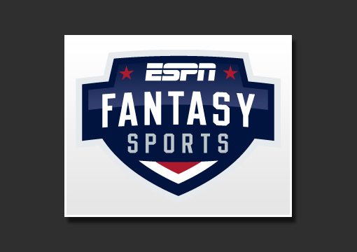
The logo above is a nice piece of work. The colors are perfect, the lettering is masculine, the overall feel is athletic and the glossy effect works well. It’s everything that it needs to be.
However, my favorite type of logo design is that which takes the assignment one step further. Rather than just making something attractive, these designers look at the design process with a pinch of added intelligence and a perspective that skewed enough to see things differently than the rest of the world.
These types of logos make you smile at the brilliance of both the idea and the execution and have several layers of meaning that can hit you in waves. Some are amazing in their obviousness to all who see them and some find excellence in hidden secrets.
I’ve broken down this collection into three categories: visual double entendres (two things in one), word and character art, and ambigrams. Ambigrams definitely also fall into the word art category but I wanted to give them special recognition because they’re so difficult to pull off effectively (if you don’t believe me, try to make one!).
Visual Double Entendres
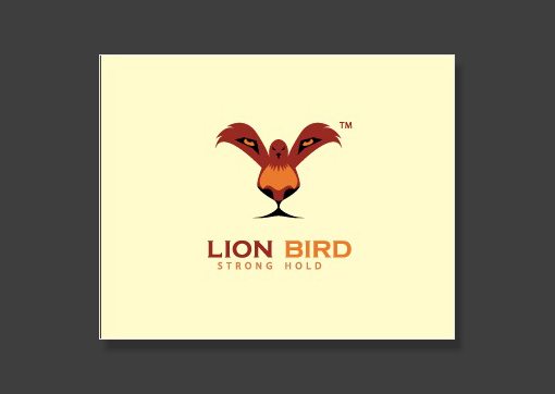
Lion Bird
If you stare straight at the bird’s feet for a second, a stunningly clear lion’s face emerges. Brilliant design!
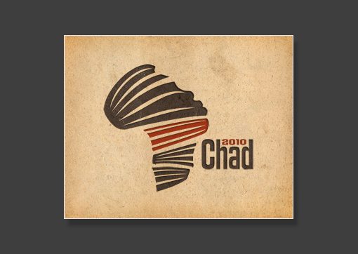
Chad 2010
I love this one. There’s a sort of ribbon theme that makes both a face and the continent of Africa.
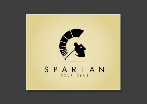
Spartan
Simply beautiful use of negative space. The golfer and his swing double as a soldier’s face.
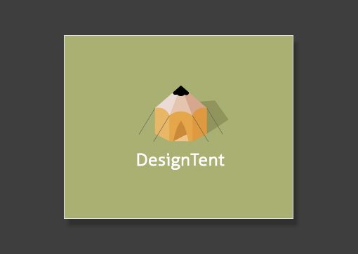
DesignTent
A tent and a pencil.
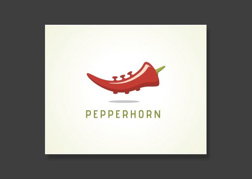
Pepperhorn
A pepper and a horn.
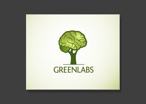
GreenLabs
Green here is symbolized by a tree and labs is represented by the brain. That’s a sharp looking tree brain!
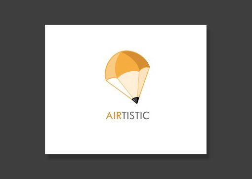
Airtistic
Another pencil idea very similar to the one above. This one is a parachute and a pencil.
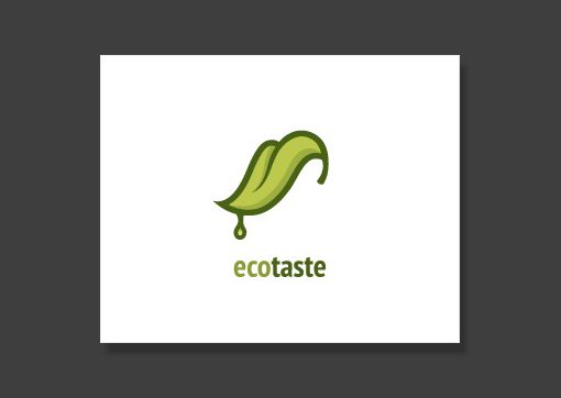
Ecotaste
A tongue and a leaf. A little creepy but a great idea!
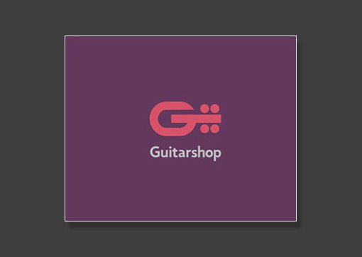
Guitarshop
The letter “G” and a guitar. Simple but effective.
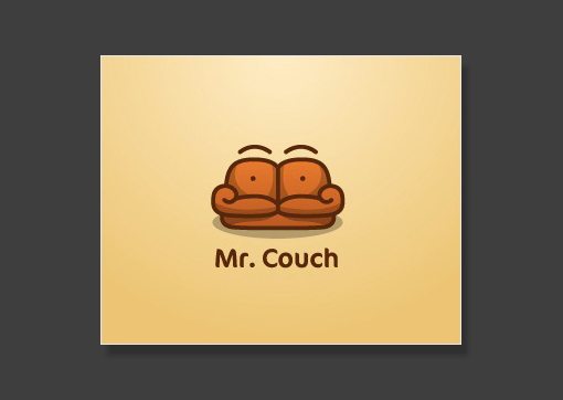
Mr. Couch
This is definitely one of my favorites. The couch has cleverly been crafted to also be a face with a mustache. Excellent work!
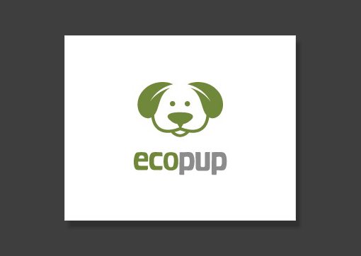
Eco Pup
The dog’s ears are leaves. Sometimes subtle is better.
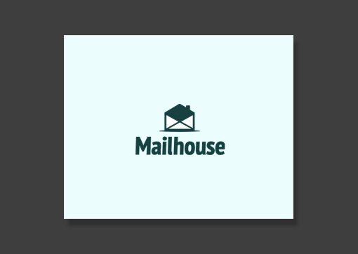
Mailhouse
The open envelope creates a house shape.
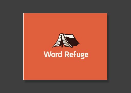
WordRefuge
The open book makes a tent. Not my favorite but it makes for a good visual read.
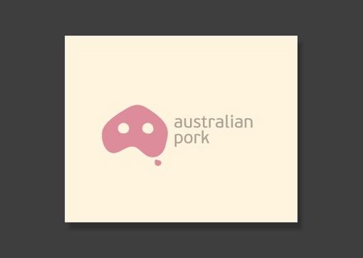
Australian Pork
This one makes me laugh. Australia has been turned into a pig’s snout!
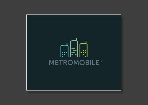
MetroMobile
The city skyline doubles as a row of cell phones.
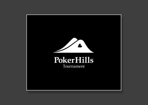
PokerHills
I love that the shape of the hills genuinely matches the shape that cards make when you peak at them while they lie face down on the table.
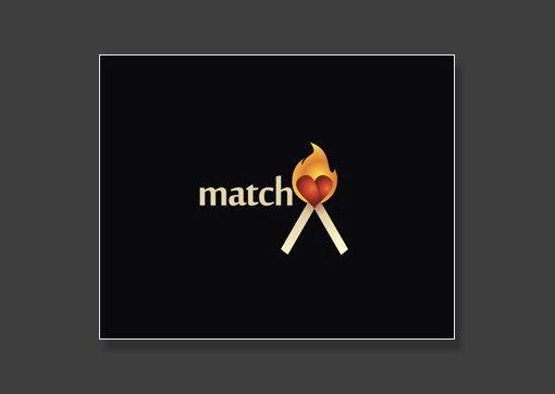
Match
This one goes on and on. The matches come together to make a heart. There are two of them (they match). Fire represents passion. etc. etc.
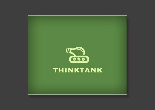
ThinkTank
Ideas are often represented by lightbulbs. Turning the phrase “think tank” into a lightbulb tank was genius.
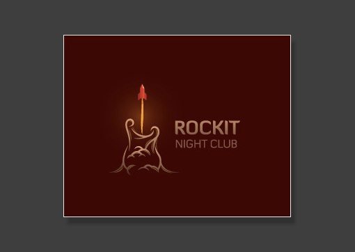
Rockit
This one is an excellent piece of art. The rocket blasting off and leaving smoke trails clearly makes a guitar shape.
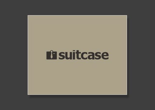
Suitcase
This one is simple but so incredibly effective. It looks like both a suitcase and a folded dress shirt with a tie. The latter really emphasizes the “suit” aspect and therefore represents professionalism.
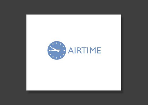
AirTime
Another really subtle double entendre. The hands on the clock make an airplane.
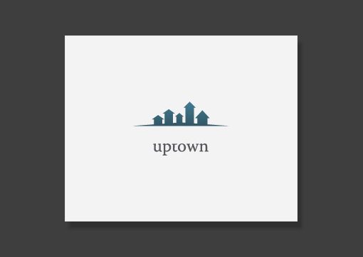
Uptown
The buildings in the city skyline are all arrows pointing upward.
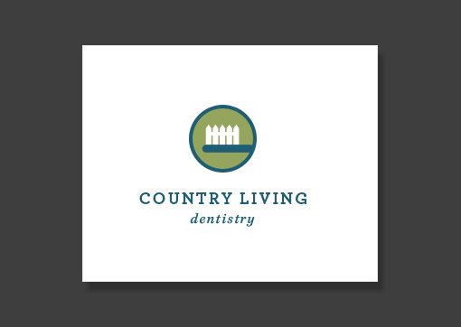
Country Living Dentistry
The white picket fence is a perfect picture of country life, here it’s been turned into a toothbrush to symbolize dentistry.
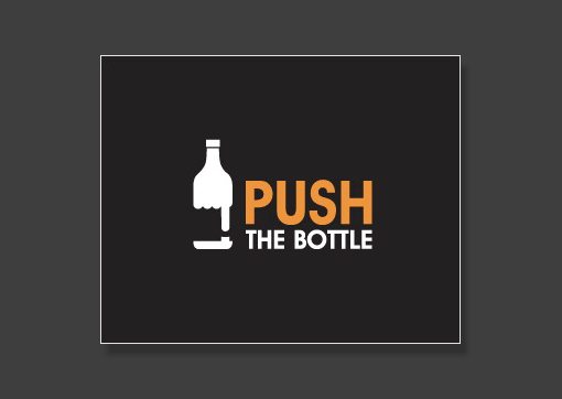
Push the Bottle
Another excellent use of negative space. The hand pushing a button makes the shape of a bottle. Notice how the fingers of the fist create the liquid in the bottle.
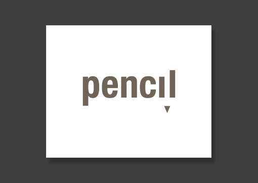
Pencil
It’s amazing how little had to be added to make a pencil appear (just a triangle!). Some logo designers really have a gift for simple touches that change everything.
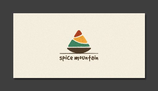
Spice Mountain
It definitely looks like both a mountain and a pile of spices.
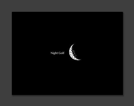
Night Golf
Not only does the round shape of the golf ball reflect that of the moon, the little dips look like craters! A great visual simile.
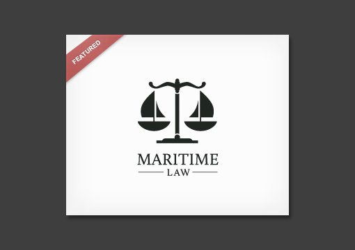
Maritime Law
The logo says everything it needs to. Scales are a clear representation of law and justice and the bowls have been turned into boats to represent the maritime aspect.
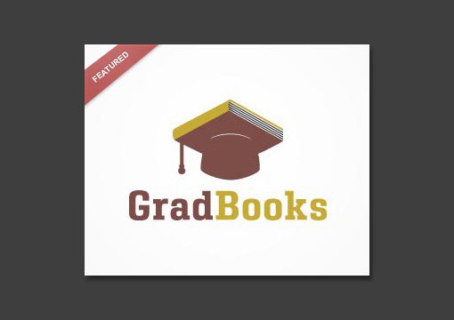
GradBooks
This idea seems a little obvious but I’m sure it took a lot of tweaking to get to this point.
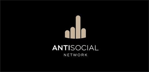
Antisocial Network
The sort of abstract skyline design is a cliche for community and has been transformed into a familiar hand gesture.
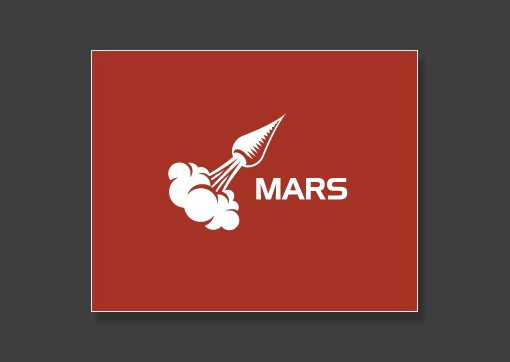
Mars
Another one of my favorites. The carrot has been beautifully crafted to make a rocket ship.
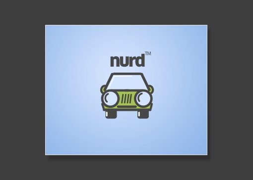
Nurd
The car’s headlights make it look like a big nerd with glasses. Yet another example of the use of subtlety in wit.
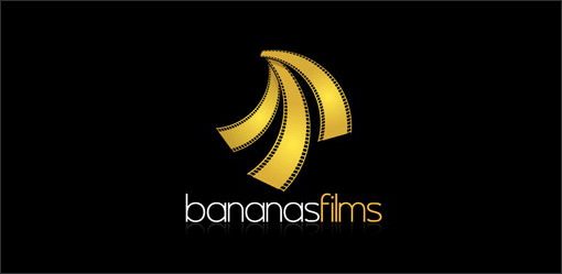
Bananas Films
The film strips have been hung to mirror the shape of a group of bananas.
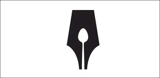
Food Writers
The negative space in the tip of the old style fountain pen has been turned into a spoon.
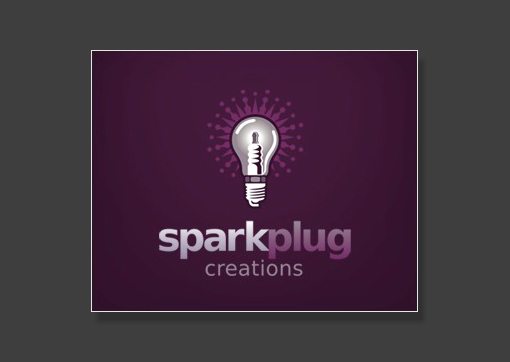
SparkPlug Creations
This is definitely not the best logo in the world, but the whole lightbulb spark plug idea is pretty clever.
Word and Symbol Art
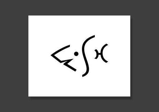
Fish
The word fish has been crafted into the form of a fish. What more could you want in a logo?
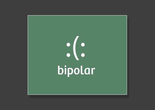
Bipolar
A few simple typographic characters that perfectly represent the word below.
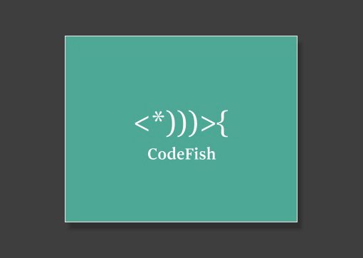
CodeFish
Coding is all about characters so it was perfect to build the fish out of typography.
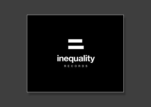
Inequality
The equality symbol has been slightly modified so that the bottom is shorter than the top; a perfect statement of inequality.
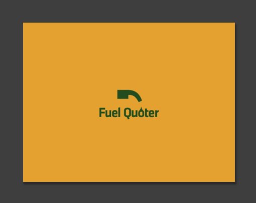
Fuel Quoter
The quote has been simply turned on its side and it looks remarkably like a gas pump.
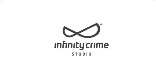
Infinity Crime Studio
The symbol for infinity has been altered to look like pair of mischievous eyes.
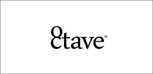
Octave
If you’re at all familiar with music theory you know that an octave has eight notes (hence “oct”). Here the “o” and “c” have been stacked to make an eight.
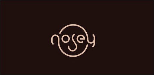
Nosey
The impressive part here is how naturally the word seems to make a face. It’s an excellent designer that makes complex ideas look effortless.
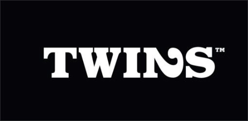
Twins
The two has been pushed over to look like an “n.” Since the word is “twins,” hiding a two in the logo was a great decision.
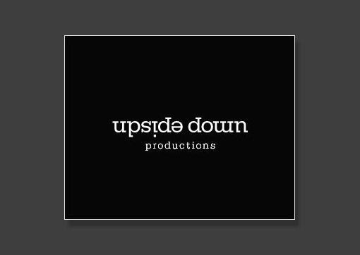
Upside Down
This one you have to stare at for a second to really appreciate. All the letters are upside down. The “w” is an “m”, the “d” is a “p”, etc.
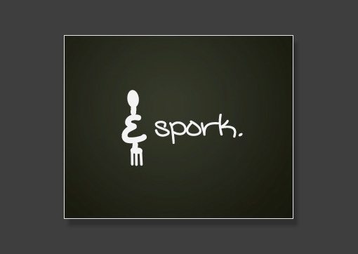
Spork
The obvious solution was to make a spoon and a fork illustration. However, putting the ampersand in represents an extra step in the thought process that makes the idea really unique.
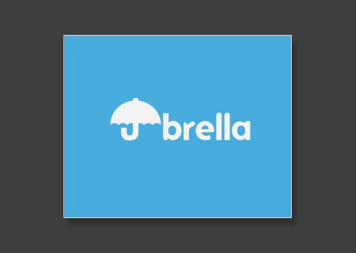
Umbrella
At first glance this logo says “brella.” Can you spot the other two letters?
Ambigrams
In case you’ve never heard of them before, ambigrams are words or phrases that you can spin around 180 degrees and still read them. They often require quite a bit of work and thought in order to make them easily readable.
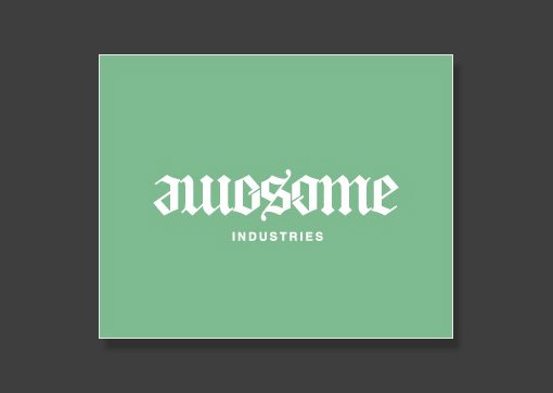
Awesome
That sort of Old English look is definitely one of the styles you see the most with ambigrams. Notice how the “e” and “o” have been heavily transformed but still read well in the context of the word as a whole.
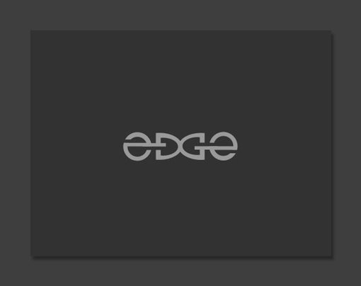
Edge
It’s not easy to create an “e” that still looks like an “e” when you spin it around. Well done.
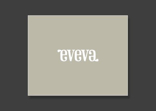
Eveva
This one feels like an ambigram, but as one astute commenter pointed out, it actually isn’t. The beginning “e” and ending “a” are the same, but the letters in between don’t work when flipped. Nice illusion regardless!
Conclusion
I hope the collection above isn’t just another “list post” but instead is a healthy dose of inspiration that encourages you to put a little thought into your logo creation process. When appropriate, consider how you can infuse something unique and witty to make the logo that much better.
Leave a link below and tell us your favorites. Also point us to any logos that match this style that you’ve seen on the web.