Create Stunning 3D Text Free With SketchUp
Everyone loves 3D text.
Unfortunately, not everyone can afford the 3D modeling software necessary to build it. Today I’ll teach you how to create some awesome 3D text using only Photoshop and a free app from Google. Intrigued? Read on!
2 Million+ Digital Assets, With Unlimited Downloads
Get unlimited downloads of 2 million+ design resources, themes, templates, photos, graphics and more. Envato Elements starts at $16 per month, and is the best creative subscription we've ever seen.
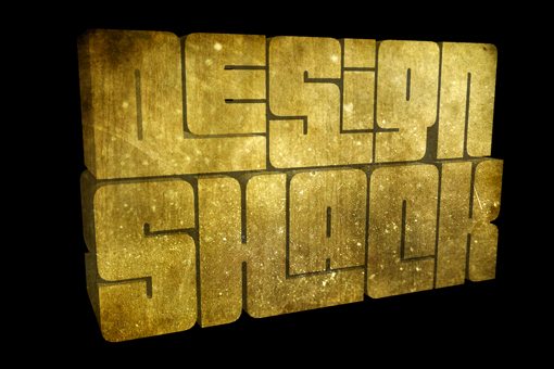
What We’re Building
Here’s a quick look at what we’ll be building today. I’ve also uploaded a scaled-down but full layered PSD file so you could have a look. Click here to download the PSD.

We’ll start by building the basic text in SketchUp. However, that will only serve as our foundation. We’ll do most of the styling and fun stuff in Photoshop.
Why SketchUp?
I know there are tons of 3D text tutorials out there but I wanted to do something a little different. There’s really no quick and easy way to build 3D text in Photoshop without just drawing in portions manually. Some designers build the text in Illustrator, but I’m not a big fan of Illustrator’s interface for building 3D objects. It feels more like faux 3D than real modeling.
Other tutorials start off in an expensive 3D modeling program like 3ds Max that you probably don’t even own.
I wanted to show you that you can get really great results from SketchUp, a completely free and easy to learn 3D modeling program from Google.
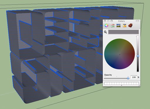
Starting Up
After you download and open SketchUp, create a new blank file. You should be taken into the main SketchUp interface with various windows and palettes.
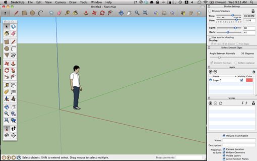
If you’ve never used SketchUp or any other 3D software, you should get acquainted with the basic functionality by watching some of the complimentary video tutorials offered up by Google.
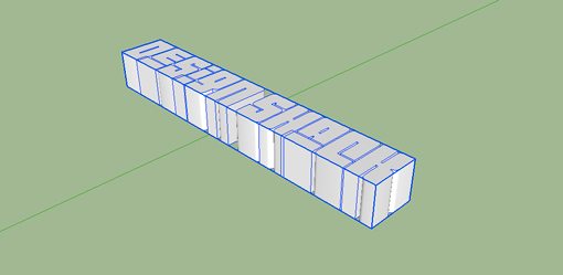
Once you’ve figured out basic navigation and have a good idea for how to move and scale objects, you’ll be ready to go. First delete the little placeholder guy from the model. Then select the 3D text tool in the toolbar on the left (should look like a 3D uppercase “A”). Now click anywhere on the SketchUp canvas to bring up the following dialog.
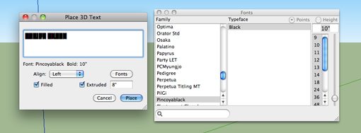
Here you can type in some text, choose a font and an specify an extrusion depth. I’m using the font Pincoyablack, a free download from Font Squirrel.
As you can see, I also chose a extrusion depth of 8″ and checked the “Filled” box. This should give you something like the following:
Positioning the Text
Now that we’ve got some good 3D text we’ll need to rotate it to stand upright and move it into position. I decided after playing around with a few alignments that having the text all on one line was not what I wanted so we’ll also stack the two words.
Hit ‘Q’ to grab the Rotate tool, click once where you want the pivot point to be and click again on the opposite side of the object. Now rotate the words so that they are standing up.
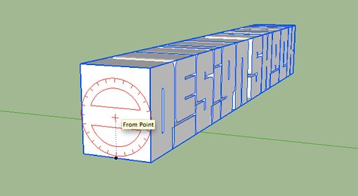
Next hit the ‘O’ key to grab the Orbit tool and swivel around to the front view. Type ‘V’ to bring up the selection tool and double click on the group containing the words to expand the letters into individually selectable items.
Now select only the first word. Triple click on each letter to make sure you select every face and edge.
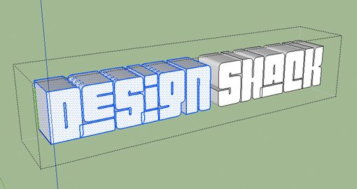
Now move the word “Design” on top of the word “Shack” using the move tool (M). Moving objects in SketchUp can be tricky if you’re not used to it. Try using the arrow keys to lock in an axis while you perform the move.
As an optional step, you can reduce the size of the word top word to be a little more proportional with the bottom word until you have something like the image below.
Final Touches
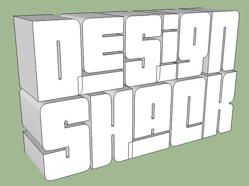
Our text is about ready to exported but still needs a couple tweaks to make it perfect. We want some good contrast between the face of the letters and the sides, so bring up your materials window and apply a dark gray to everything but the faces. The easy way to do this is to select only the faces and then go to Edit>Hide (Command+E). Then you can apply the darker color to everything and unhide the faces. Alternatively, just select everything and then deselect the faces.
You’ll also want to bring up the Shadow Settings window and check “Display Shadows.” Just play with these settings until you get something that helps set the faces apart from the other parts of the letters.
Refining the Styles
We’ll be exporting a flat JPG to Photoshop and then building selections so the last step here is to make the selections easier by adding more contrast and doing a little cleanup. Bring up the Styles palette and uncheck “Display Edges” under the Edit tab. This will give you a nicer, more believable 3D look.
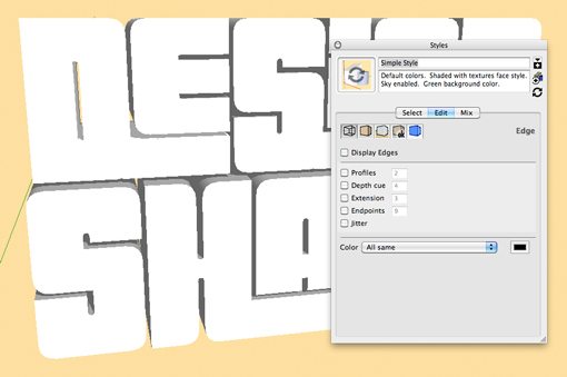
I’ve also given the background a solid color via the Mix tab. This plus turning off ground shadows will make it easy to create a Photoshop selection for the text.
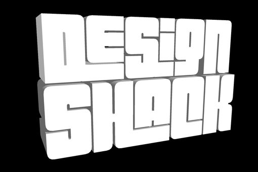
Use the Orbit tool one final time to position the text just like you want it and then export the model as a 2D graphic at any size you want (I did 1500 px wide).
Photoshop Work
Now we’re ready to open the image in Photoshop and doctor it up. You could use the Pen Tool to meticulously select around the words but the Magic Wand tool plus Refine Edge does a surprisingly great job. Grab you Magic Wand, deselect the “Contiguous” option and click on the background. This will select not only the background, but also any places in between the letters where the background is poking through.
Next inverse the selection and use Refine Edge to make sure you have a nice hard edge selection with no background color showing through. When your selection is finished, apply a mask to clip off all of the image’s background color.
Adding Texture
You’ll want a nice, realistic texture for the letters. I stopped by Flickr and grabbed one called “Sand and stone texture”.
Drop this texture in over the layer containing your SketchUp text and go to Layer>Create Clipping Mask.
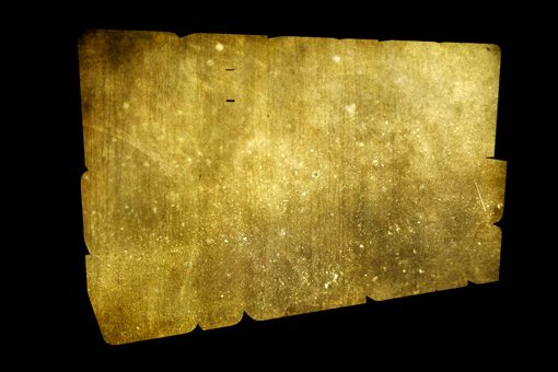
That should clip the texture into the shape of the letters like in the image above. Now set that layer to Multiply to have it take on the contrast of the SketchUp text.
Next I added a Levels adjustment layer to add some contrast.
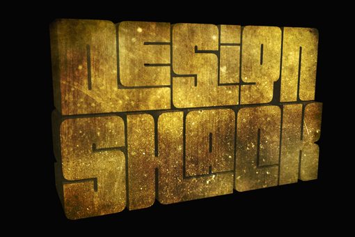
The Background
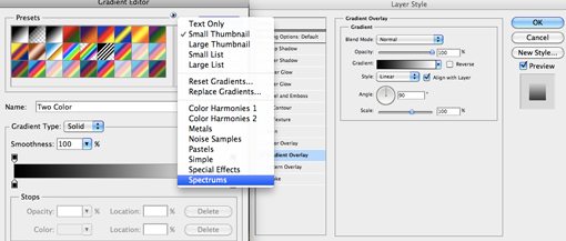
Now create a solid layer over the black background layer and apply a gradient overlay. In the gradient editor load in the spectrums and choose one you like.
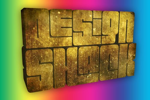
This should give you a crazy colorful hippie background.
To make it less hippie, create a new layer, fill it with white and go to Filter>Render>Fibers (make sure your selected colors were black and white). Put a vertical motion blur on the fibers (Filter>Blur>Motion Blur) and set the layer to multiply.

Now merge those two layers, reduce the opacity, apply a solid black mask and paint the spectrum into selective areas using a large soft brush.

Finishing Up
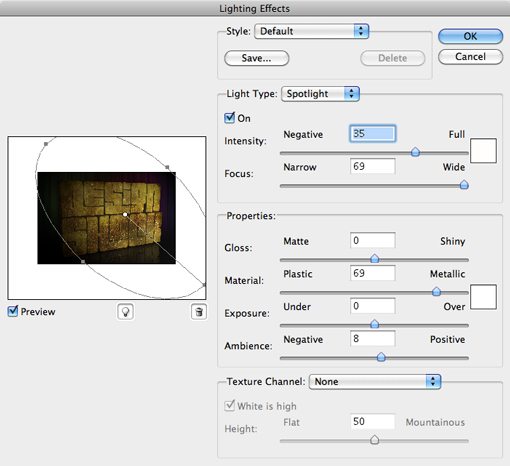
To finish the image off, I painted in some shadows in near the bottom and added a reflection. Also, to make it all look a bit more realistic, I went to Render>Lighting Effects and applied a spotlight effect.
Finally, I went along all the seams and edges in the text and burned them a little just to up the contrast and make the shadows a little darker.
Final Result
And with that, our image is completely finished.
Conclusion
As you can see, SketchUp is more than capable of producing a great base object to build 3D text on. It’s much easier to get the result you want than using Illustrator and doesn’t cost you a cent to use. As long as you know your way around Photoshop and have a decent amount of creativity, great things are possible.
Use the comments below to let us know what you thought of the tutorial. I breezed through it pretty quick so feel free to ask detailed questions about any part of the process.