How to Revive an Outdated Design
Today we’re going to examine a real-world issue that frequently faces designers. Updating and old design can be a daunting task, whether it’s your own or someone else’s. Once you see a design presented in a certain way, it’s hard to break out of that mental box, even if you don’t like the original.
The article below will tackle a number of touch issues for designers. We’ll be dealing with outdated graphics, readability on a dark background, information overload, working with textures and more. Keep reading to see how we tackle these problems.
The Ultimate Designer Toolkit: 2 Million+ Assets
Envato Elements gives you unlimited access to 2 million+ pro design resources, themes, templates, photos, graphics and more. Everything you'll ever need in your design resource toolkit.
The Project
Today’s project comes from two inquiries from our Design Dilemma page, a new section where we ask designers to let us help them with actual problems, free of charge.
The first question is from Atif Mohammed Ameenuddin. Atif stumbled across some awesome free textures and wants to know how he can incorporate these into an attractive web design.

Also, Joe Elias is having trouble designing a website for a client. He has an initial Photoshop mockup but knows that it needs some help. There are some merits to Joe’s design, but I think overall it feels a bit outdated. I get the impression that a print designer is trying to convert a flyer design to the web. These days web design is much more than interactive print design, it has a unique look and feel that takes advantage of the rich web medium.

Notice that the site is also for a septic tank service! Not the easiest design task I’ve ever undertaken but I do like a challenge. let’s jump in and get started.
Using the Background Patterns
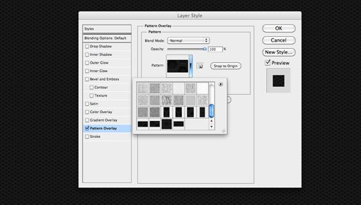
Step one is to head over to Premium Pixels and download the background patterns. These are conveniently already saved as a Photoshop pattern plugin so they couldn’t be easier to implement.
Once you’ve downloaded the pattern file, simply drag it to Photoshop to automatically install it. Next, create a new RGB document that’s somewhere around 1200px by 1300px. Fill the background layer with white and add a Pattern Overlay layer style. From here you can simply select the pattern you want and adjust the size to your liking. Make sure you’re viewing the document at 100% so you can size the pattern correctly.
The Logo
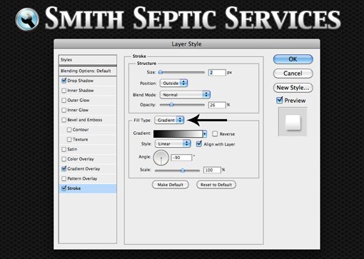
I took the liberty of updating the logo a bit (the designer likely doesn’t have the freedom to do this). It’s definitely not great and could use more work but it fits with the masculine theme a little better.

I used the existing wrench icon and just combined it with a manlier typeface. I also added a text stroke with a gradient just to add some visual interest. Many people don’t realize that you can change the Photoshop stroke to a gradient instead of a solid color, this option is found near the bottom of the stroke window.
The Four Boxes
Next up, I want to address the four boxes shown below.

One of the main points of Joe’s email was that he wanted a few layout/organizational ideas. I think this area can be turned into something much more dynamic and attractive with a little jQuery. With the magic of JavaScript sliders, we can take all this information and put it into one area.
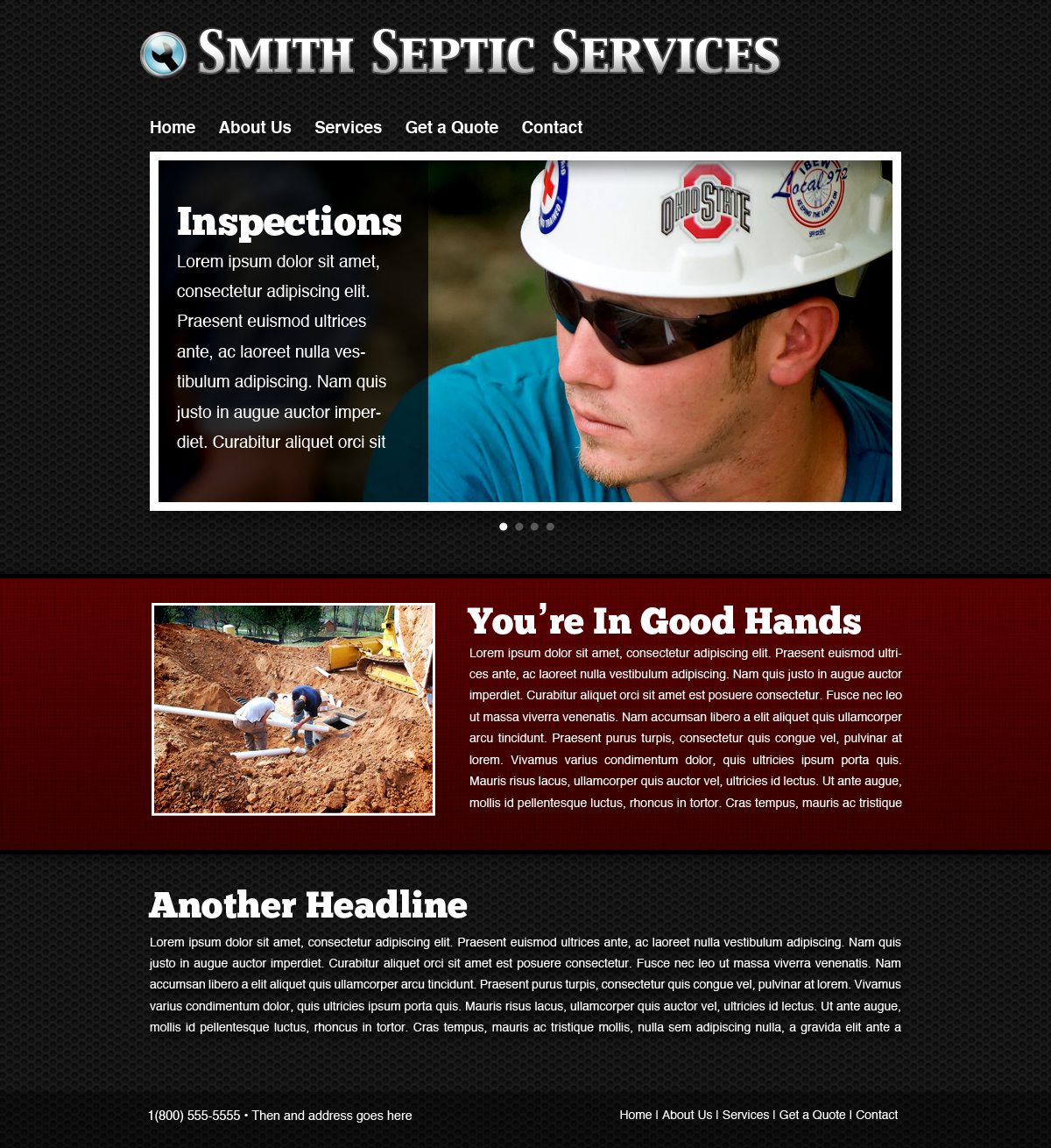
It’s hard to show in a static image, but basically this area would automatically cycle between four images that represent each of Joe’s four boxes above. Notice that we’ve made a lot of room for text content as well with the screened back area on the left. There are a ton of free jQuery sliders available online, many of which have content areas like this built-in.
To help the image stand out on the background texture, I gave it a basic polaroid treatment. This involves a drop shadow, a stroke aligned to the inside (this gives you hard corners instead of rounded) and a slight inner shadow. For the photo, I just grabbed something from Flickr because I didn’t have the original images Joe was working with.
Breaking Up The Background
The original design had quite a bit of text on it. We need to honor the client’s wishes by including it, but it’s our job as designers to present the information in an attractive way. We’re going to do this by splitting it up a little, which will turn the content into more manageable chunks.
The textured background can be a little too much over the entire page so we’re going to break it up a little by adding a horizontal stripe. This will also help visually organize the content.
I’ve done a lot here. For the banner, I gave it a dark red color, slight gradient, thin black stroke, subtle texture and shadows coming off both the top and bottom (click the image to see it full-size). I also threw in another image to help break the text up even further. Notice that it lines up horizontally with the slider above it. Though the banner itself stretches all the way across the page, the content inside still needs to adhere to the layout we’ve set up.
The Rest of The Text
I placed the second part of the text block right on the background below the ribbon area. The tricky part here is that the background makes thin text quite hard to read. Always do your best to not sacrifice usability in the name of aesthetics.
To solve this problem, I simply applied a really dark shadow to the block of text. This helps it stand out and can easily be accomplished with CSS, leaving the text fully selectable.
When combined with the banner area above, this makes for a much more attractive chunk of text that doesn’t overwhelm the page.
Finishing Up
Lastly, we’ll throw a simple footer at the bottom of the page with come contact information and we’ll be all finished. All I did here was make a black box and reduce the opacity a little.
And with that, here’s our finished product. Click here to see it full-size.
As you can see, it has a much more modern feel than the original. Honestly, the mistake that most designers make is that they try too hard. They cram a page full of everything they can think to put in there and end up with something that’s busy and hard to look at. The current trend in professional design is towards simple, clean layouts with minimal distractions and an emphasis on the content.
As designers, this means we can take the easy way out and strip all the fluff from our designs until we find that perfect balance between simple and attractive.
Conclusion
To sum up, updating an old design can often involve stepping away from the previous layout completely. Don’t get caught up on keeping things the same and making incremental changes, sometimes you just have to start from scratch and search for a fresh idea.
If you have a project that you’d like some help on, be sure to check out our Design Dilemma program. If we think your problem is something that lots of designers can relate to, we’ll turn it into a full-blown article like this one.