How to Use Visual Hierarchy in Web Design
Sometimes you look at a site that may be attractive enough, but something is missing. It has great colors, nice graphics, perfect alignment and clever copy, but there’s just something a bit bland about it. Though everything looks nice, nothing is really coming through vividly on a greater level than anything else. This solution to this problem is visual hierarchy.
Designers are often intuitive enough to give the elements on the page a clear hierarchy without even thinking, other times the lack of intention in this area leads to a design like the one described above. This article will examine some of the basic principles of designing with a visual hierarchy of information in mind.
2 Million+ Digital Assets, With Unlimited Downloads
Get unlimited downloads of 2 million+ design resources, themes, templates, photos, graphics and more. Envato Elements starts at $16 per month, and is the best creative subscription we've ever seen.
Principles at Work
The reason visual hierarchy is so important is because by mastering it, you can have immense control over how a visitor reads your page. In an ideal world, every viewer would read all of the information on the page thoroughly, allowing you infinite time and space to get your message across. However, the reality is you’ll likely only have a few seconds to grab someone’s attention and tell them what the site is about before they turn away and go elsewhere.
By establishing a clear hierarchy of graphics and information, readers almost can’t help but unconsciously follow the path that you’ve set out for them. Technically, no two people will read a page the exact same way but you can create strong trends towards the manner you prefer.
This plays out over a number of different areas and methods. Visual hierarchy can be established through an element’s position, size, color, and complexity in relation to the other elements on the page.
To structure your message properly, you’ll need to consider everything from the fonts you use to the whitespace around a given object. Always be conscious of what is drawing attention on your page and make sure that it’s intentional.
Position
Position is one of the most basic ways to establish hierarchy. Consider the following example:
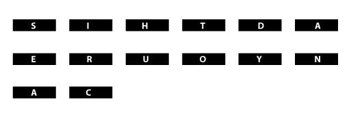
Odds are, upon first looking at this image, you weren’t quite sure what was going on. Your eyes probably darted around a little, looking for a distinguishable pattern. Now look at this example, using the same letters.

Suddenly, though the message is still distorted by physical space and unnecessary shapes, it becomes much easier to decipher when we reverse the order. Though both messages caused your eyes to wander around the image, the second one made it much easier to see the letters coming together to form words than the first. This is because you are used to reading from left to right. When there is uncertain visual chaos on a page, the first way your brain wants to try to organize the information is in the order you were taught to read: left to right, top to bottom.
This is not meant to shock you, it’s obvious that we read left to right. However, becoming more consciously aware of this tendency will help you structure your content appropriately. Remember that this principle extends beyond words into graphical items on a page. If you present your users with a grid of objects, fairly similar in size, shape and color, they will have a tendency to read the grid from left to right unless otherwise prompted.
Isn’t this boring?
You might be wondering what your designs would be like if you strongly adhered to the z-reading principle above. The answer is incredibly dull and unoriginal.
The goal then is to be able to line objects up on a page in a more attractive fashion while causing the reader to disregard their subconscious tendency to read in a “z.” This is accomplished through the use of the other principles of visual hierarchy discussed below.
Size
In the design world, size definitely matters. By varying the size of items on a page, you can easily break the z-pattern tendency.
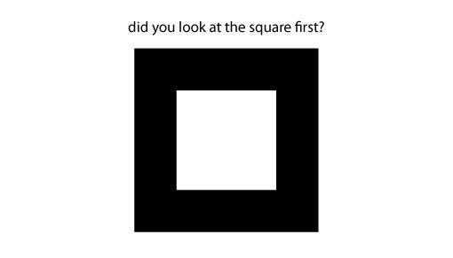
Despite the fact that the written question is higher than the square, the sheer size and boldness of the square draws your attention before the words. Let’s take a look at this principal practically applied to web design.
This is an extremely simple page that uses a clear visual hierarchy. The quote in the center of the page is large enough to be the first object that draws your attention. After this, the logo in the top left is not only the natural place to reset your reading tendencies, but is also the next largest item of contrast on the page. The designer has structured the site so that if you only spend a few seconds on the page, you read “Think Big. Be Nimble.” followed by “Hobson Dungog + Davis.”
This is classic manipulation of visual hierarchy at work (notice that whitespace is heavily at play as well). It would’ve been easy to setup the quote to appear in the top left followed by the logo, but the layout wouldn’t have been as interesting or flexible.
Color
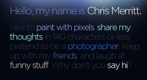
Clever use of color can be one of the most visually interesting ways to differentiate elements on a page and draw attention where you want it. Your brain’s obsession with contrast will cause your eyes to focus on objects that stand out due simply to their difference in color in relation to the surrounding objects. Consider the following example:
This designer has utilized several contrasting and complementing color tones to establish visual hierarchy in what would otherwise be a monotonous block of text. The brighter sections draw your attention and make it easy to get the gist of the paragraph without actually taking the time to read it.
The context comes heavily into play here as well. If this were a print design, you wouldn’t think anything of the brighter colored text beyond that it was meant to grab your attention. However, on the web, your brain will expect these obviously intentional areas of focus to signify something more significant: in this case, a link. And turning the brighter text into links is exactly what this designer has done. Despite the untraditional formatting represented by the lack of a navigation area, you can quickly figure out how the site works because of the use of, you guessed it, visual hierarchy.
Visual Complexity
The last way we’ll look at to control visual hierarchy is through visual complexity and discernible patterns. The principal here is that if you want something to stand out on your page more than the objects around it, make it considerably more or less complex. Even if the objects are a similar size and color, the greater complexity will add to the visual interest.
This principle ties in heavily with discernible patterns. As previously mentioned, your brain is constantly trying to make sense and force order upon the chaos of pixels you see on the screen. It will therefore cling to the areas that are not only the most interesting due to their complexity, but also those items it can impose a familiar schema upon.
The basic example above can teach us a lot about how we focus our attention. There are two areas of the image that stand out the most. The first and most obvious area is the two peculiar shapes in the top row. Not only are they more visually complex than the objects around them, they are also reminiscent of something familiar: a pair of eyes. Despite the chaos around them, these shapes draw your attention because faces are among the most familiar, friendly or even threatening objects we encounter. If you want to set a given area high in the visual hierarchy no matter where it’s located on a page, you can’t go wrong with a face.
After giving up on the pair of eyes, your next likely target is the two repeated triangles in the bottom row. Here again your brain is trying to impose order. It understands this area a bit more than the others due to the repeated element. Using selective repetition in your designs is an excellent way to add visual interest, connect distant objects, and lead the viewer along the path that you want them to go. To use repetition effectively, simply implement the variables we’ve just discussed (size, color and complexity) as the basis for the repeated element.
Conclusion
The goal of this article was to make you more aware of how to use the concepts of visual hierarchy to control the prominence of objects on a page and steer your viewers in the direction you’d like them to go. I hope that I’ve succeeded in causing you to consciously apply a clear and intentional hierarchy in every element that you design.
Use the comments below to tell us what you thought of the article and whether or not you had ever given much thought to your use of visual informational hierarchies.
