Photoshop Blending Modes: Beginner’s Tips and Tricks
Photoshop’s blending modes are a source of constant confusion for many designers. There aren’t really any sort of built-in examples for you to see and the blending mode names are no where near intuitive suggestions of what the effect actually does to the appearance of your document.
Today we’ll help remove a little of the mystery by discussing how a few key blending modes work in addition to some hints for how to use them effectively.
Multiply: A Good Place To Start
We’ll start off our discussion with the quintessential blending mode: Multiply. If you only learn about one blending mode, make it Multiply.
The best way to learn what something is in Photoshop is to look to the Help menu. From here we find this description of the Multiply blending mode:
“Looks at the color information in each channel and multiplies the base color by the blend color. The result color is always a darker color. Multiplying any color with black produces black. Multiplying any color with white leaves the color unchanged. When you’re painting with a color other than black or white, successive strokes with a painting tool produce progressively darker colors. The effect is similar to drawing on the image with multiple marking pens.”
This helps a little, but now we’re wondering how to multiply colors in our head! To make this a little less abstract, let’s see it in practice with a few helpful examples.
One of the many ways you can use Multiply is to remove the white from an image. Consider the following example:
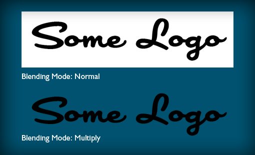
Above you see two identical layers thrown onto a colored background. Both have a white background and a simple black logo. The top version’s blending mode is set to Normal and the bottom’s is set to Multiply. Magically, the white background disappears! We didn’t have to make a selection or anything else fancy, the only step is to change the blending mode.
Another thing that Multiply is great for is inserting Photoshop graphics into a photographic scene with a certain degree of believability. Let’s say you have a graphic that you’re trying to stick on a golf ball. You could simply lower the opacity of the layer, but it’s not going to blend well with the background.
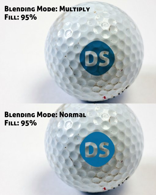
Notice that the version set to multiply does a much better job of appearing like it’s actually printed on the ball. The illusion isn’t complete and could definitely use a bump map, but it’s a solid start.
Things To Keep in Mind
I find myself using Multiply mostly when I’m working with very simple graphics and lots of solid colors. The thing to keep in mind is that any white on the Multiplied layer will disappear completely. For this reason, it makes a great tool to replace what would be white pixels in a layer with a light colored background in a another layer.
Screen: The Opposite of Multiply
Another extremely useful blending mode is Screen. Here’s Adobe’s description:
“Looks at each channel’s color information and multiplies the inverse of the blend and base colors. The result color is always a lighter color. Screening with black leaves the color unchanged. Screening with white produces white. The effect is similar to projecting multiple photographic slides on top of each other.”
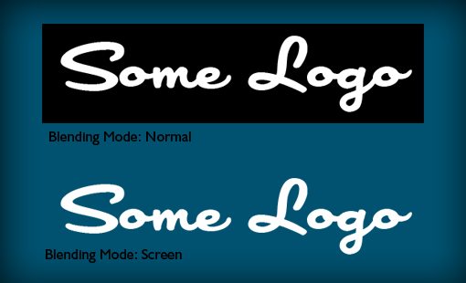
I like to think of Screen as the opposite of Multiply. So where Multiply always produces a darker color, Screen always produces a lighter color. Where Multiply makes white pixels disappear, Screen makes black pixels disappear.
To see this in action, we’ll use a slightly altered version of the example above.
So on a more practical level, how would you use screen? Consider giving screen a shot any time you have something that you want to quickly remove from a black background and making a selection is too tedious. For instance, one of the most common tricks you’ll see online is to apply a lens flare to a black layer and then set that layer to Screen.
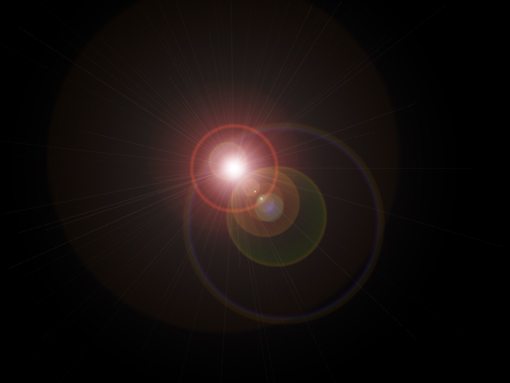
The reason you would do this is to have the lens flare on its on layer. The Photoshop lens flare filter won’t work on an empty layer so you’re normally stuck applying it to the photographic layer, where it won’t be re-positionable. With this method, you can keep the lens flare separate and tweak the position, opacity, etc. as you please!

One thing to keep in mind, Photoshop lens flares are a bit passé and easily misused. In my example above, why would grass be reflecting enough light back at the camera to cause a flare? It wouldn’t, but now you know how screen works don’t you?
Beautiful Grunge: Color Burn
The examples above are nice, but you want something more fun right? Enter Color Burn: the key to awesome grunge graphics. Here’s Adobe’s explanation:
“Looks at the color information in each channel and darkens the base color to reflect the blend color by increasing the contrast between the two. Blending with white produces no change.”
The key here is that Color Burn adds contrast. I find that it works superbly when I have a fairly light background and dark text or graphics. As an example, let’s start with the following image:

It’s fairly grungy by it’s own merit but the text and the background don’t really feel like they’ve been integrated at all. We’re covering up a lot of that amazing texture from the background photo.
To fix this, we need only to set a few layers to Color Burn. Now all of a sudden the contrast shoots through the roof and the texture is showing through. The result is much more visually interesting than the original image.

Fill Vs. Opacity
There are plenty of more blending modes to look at and experiment with, but I want to focus on a topic that I haven’t seen discussed as much elsewhere: how layer opacity differs from layer fill in respect to blending modes.
If you Google the difference between layer opacity and layer fill in Photoshop, you’re likely to see a discussion about layer effects. In this regard, reducing the opacity of the layer will dim both the layer and all its included effects. Conversely, reducing the layer’s fill will dim the layer without affecting the appearance of the effects.
So if we have some text with a drop shadow applied to it, reducing the opacity will affect both the layer and the drop shadow whereas reducing the fill will leave the appearance of the drop shadow in tact.
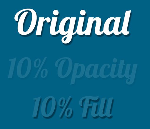
However, what most people won’t tell you is that layer opacity and fill will also produce different results in some blending modes. To illustrate, consider the example below:
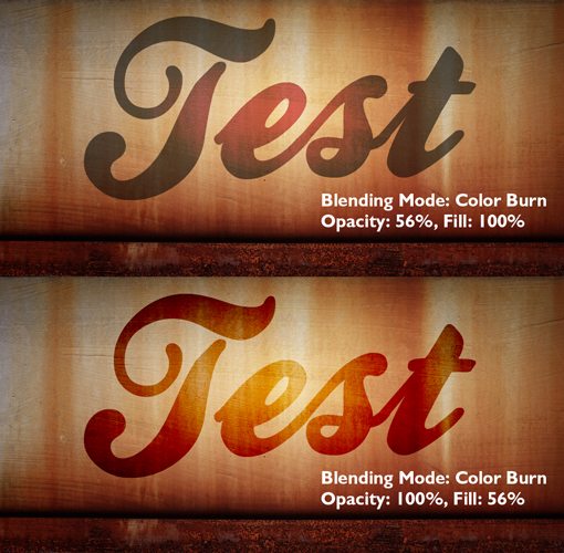
Here we have two identical layer setups with the same blending mode. The only difference is that one uses Opacity to dim the layer and the other users Fill.
Notice how reducing the layer’s fill picks up much more of the background subtleties than reducing the layer’s opacity. Before I figured out this difference I would frequently find myself disappointed in the results that I was getting while toying around with blending modes.
Now as a rule of thumb, I generally compare the difference between layer fill and opacity on each project to see which results I like better (fill is almost always the winner).
Conclusion
To sum up, if you’re new to blending modes, at the very least you should be familiar with Multiply and Screen. These are practical workhorses and you will find tons of potential uses for them if you work in Photoshop for long enough.
Some other fun blending modes to try out include Color Burn, Overlay, and Color Dodge. To see what each does, create a document with a light background and some dark text (and another with the inverse) and then apply each of the blending modes while varying the Opacity and/or Fill of the layer.
Leave a comment below and let us know what blending modes you use most often and how you implement them. Be sure to leave a link to any examples you have!