Design Shack showcases inspiring web design, alongside resources and tutorials for you to succeed in the same way. It is carefully curated and edited by Josh Johnson and David Appleyard.
Written by Joshua Johnson, On 5th January 2010.
Filed in Graphics, Inspiration, Layouts, Navigation.
A strong footer can leave your visitors with a lasting positive impression.
There are tons of creative ways to boost the cool factor of your footers by focusing on both form and function. Below you’ll find 10 simple ideas to inspire you towards footer greatness.
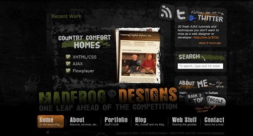
This sounds crazy right? Why would anyone in their right mind take the primary navigation, traditionally placed in the header, and put it at the bottom of the page? It goes against so many rules and can be an absolute disaster for usability. However, if executed properly, footer-based navigation can be easy to use and refreshingly different. The example above uses a large stationary footer that lays on top of a scrolling page. You can even toggle off the navigation menu to view the page content in its full glory. This is an excellent implementation of a risky idea. Two thumbs up to Madfrog for originality.
One feature that I really love in a footer is a button that takes you back to the top of the page. On lengthy pages, you’ve done some serious scrolling by the time you reach the footer and the trek back up can be a long one. You can overcome this annoyance with a simple JavaScript button that sets the scroll position. See the implementation in the examples above as well as on the Madfrog footer from the previous tip.
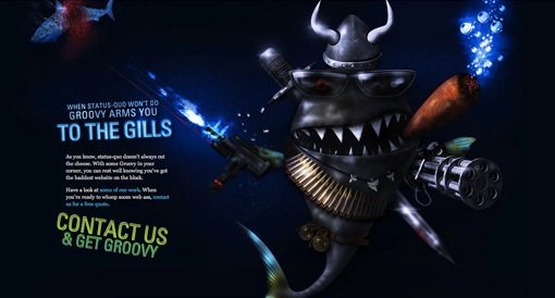
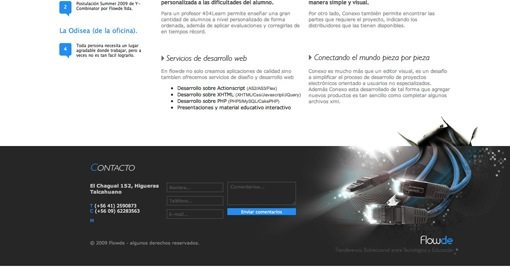
If you want a strong footer, don’t leave any doubt as to where it begins. Using a simple line or graphic to differentiate the main content from the footer helps, but giving the footer a drastically darker (or lighter) background color goes even further. The example above actually uses both techniques. The dark footer background contrasts nicely with the white page background and they’ve added a beautifully eye-catching graphic that is engineered to steer your attention toward the contact form. To take the example further, placing a simple contact form within the footer is another way you can increase it’s functionality.
If you’re a talented illustrator, the footer can be a great opportunity for a creative element that allows you to break away from the strict but necessary utility of the page above. If the footer is going to be the last thing a user sees on the site, you might as well go out with a bang. The two sites above have implemented huge, ridiculously amazing illustrations that serve almost no purpose beyond just looking really cool.
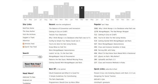
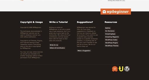
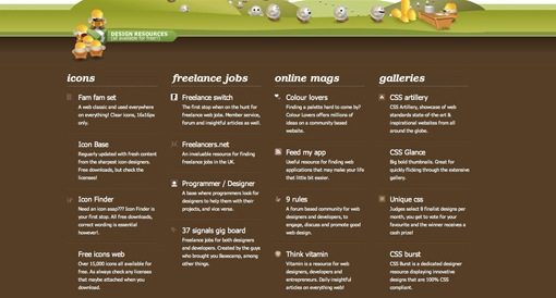
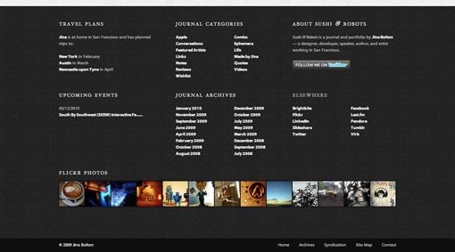
There’s definitely a strong argument for keeping footer content simple, and trust me, I’d be the first to make it. But there’s also plenty of occasions where it’s appropriate to just cram a bunch of stuff into your footer (in a stylish and organized fashion of course). The three sites above have opted to do just that. There is often plenty of content, such as legal copy and blog archive links, that you want the user to see without cluttering up the primary content of your page. An oversized footer is a convenient and logical place to put such content.
Notice from the examples above that this is also a great place to put a list of free resources for your users. No matter what kind of site you have, providing a list of free external resources is an easy way to add value to your site in the eyes of your visitors.
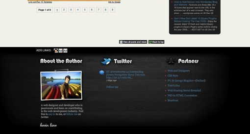
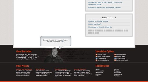
Can’t think of anything to put in your footer? Try your face! If you’re creating a blog or portfolio, it’s appropriate to include information about the site owner (be that you or your client). Write yourself a short, witty bio, throw it next to your ugly mug and suddenly your site is transformed from cool and professional to inviting and personal. Obviously, contact information is a natural complement to this setup if you’re looking to add even more content.
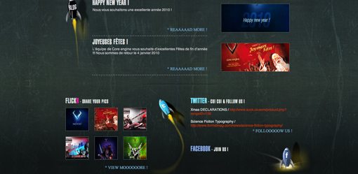
Along the same lines as the personalization in the previous tip, the footer is also a natural place to include all of your various social media links and widgets (you know you’ve got a ton you social media nerd). This is a common enough practice that the footer often the first place I look for social links. Don’t stop at Facebook either, go crazy and throw in your Twitter feed, Flickr stream, and even a MySpace link if you’re unfortunate enough to have one.
Just remember to style each peace to fit your theme and give the footer elements a cohesive look instead of throwing in a bunch of prefab, mismatched widgets. The example above uses rocket ships and CSS styling to tie it all together in a fun and unique way.
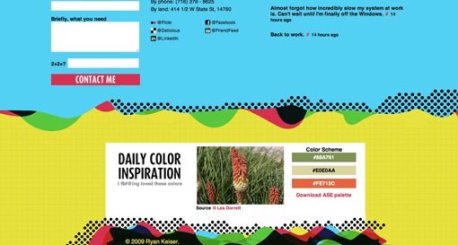
Another great feature for your footer is to come up with a unique idea for a brief daily feature that complements your site. Try to think of something useful enough that a user would conceivably check in from time to time just to see it. The example above is a designer’s website featuring a free, downloadable daily color scheme in the footer. This is both practical and relevant to the site’s audience. Think about who is visiting your site and what they might be interested in.
The site above was the only example I came across that used an interactive infographic in the footer. Consequently, I spent more time playing with that footer than I did staring at any of the others. To get a feel for what I mean by infographic, check out this post on 25+ Useful Infographics for Web Designers. Essentially, infographics are a way of conveying boring data in a visually creative and interesting way. Think about the information in your footer and how you can present it in a more interactive and attractive way.
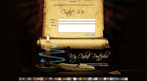
A little bit of animation goes a long way towards adding visual interest to your page. The footer in the example above features animated insects dancing around a candle flame. The effect is an eye-catching footer that you can’t help but stare at for a few seconds. I recommend keeping your animations simple. The goal is to make it appealing without detracting too much from your primary content. Other ideas for subtle animations could include pulsing colors, floating clouds, and scrolling news tickers.
There you have it, enough creative footer suggestions to keep you going all year. Use the comments below to let us know which examples you think are the best and be sure to tell us about any that we missed!
Footer examples found on Footer Fetish.
Copyright © Design Shack 2005-2010 | Back to Top


Illustrate the Heck Out of It – yum!
I always feel a bit like ugh.. when I come to the footer. I’ve just done a whole page design and now I have to a damn footer. So I just draw up something quick.
I like the idea of having a fixed navigation for the footer, but this only works if it takes up less than 10-15% of the screen. Otherwise it just distracts the reader from the content.
When it comes to the footer design I think the main aim is too get the reader to continue browsing the site. By putting links to posts, pages and other content the reader is likely to stay and browse your site further. It is for this reason, that I quite like the Pack it with content method. Although I believe the footer should, by all means, not be cluttered.
I guess that only applies to websites that regularly post content. When it comes to portfolio and company websites I guess you just want to make a good last impression.
Nice article Josh :)
You have to bear in mind that the footer is probably the last thing on your page that a visitor is going to look at, and therefore your last chance to keep them on your site. It’s for this reason that I always opt for the content option, and try and get as much interesting links/words in there as possible, just to keep them browsing your site.
Anyway, great article :)
I’m a big fan of footers that stand out but I’m not sure if I can agree with the decision to make it the primary navigation. This conflicts with deeply rooted UI patterns and will probably confuse visitors/users.
Yes. I love creative footers. Great post , their are a lot of stellar examples in this.
Great post, tnanks!
Thanks for the feedback!
I find that if I am working on an large and extensive website, the footer can be valuable screen real estate for third tier content.
And, though I agree with you that the footer should not be an after thought, I will say that your footer design, as in anything else regarding the design of a given site, should match the tone of the site as a whole.
great set, very refreshing ideas… thanks for sharing
This is GREAT! Totally gonna use some techniques!
I am sometimes confused .. What does the actual footer?? Finally, now I get inspiration.
Thanks …
Wow that’s an interesting post with very creative examples. Thank so much for sharing Joshua!
How about no footer at all? On my new website I am not even including a big footer, just a faded out logo.
Great post! Not as good as your footer though.
This is a fantastic post with some great suggestions, the best one for me was the back to top link. So simple and yet would improve the usability of some sites so much, I’ll be implementing that and some of the other suggestions for sure!
This has been really helpful- most website footers are so drab and boring. I need to design my own footer one of these days >.<
Wow cool stuff! You must have worked really hard to get this collection.. Good job! Thanks..
Great Footer – i love the design of the second footer! Thx for the great post
Thanks for the great work, good insight and outstanding depth in this blog post.
I am sometimes confused .. What does the actual footer?? Now i got some idea. thanks for the post.
Very good ideas. I´ve never seen this good uses for footer, thanks!
This is a nice article. We must add some of those to our footer gallery – http://www.footerama.com
You should be able to check some great designs there too, with tiny bit of comments. :)
Using JS to operate a back-to-top link? That makes it unusable for me and many others. Moving the navigation to the footer? That could only be done if its proper position in the mark-up could be maintained: otherwise, it would be potentially a huge problem for users of assistive software (it would have to be combined with a skip link if anyone insisted on doing it) and little better for anyone who cannot use a mouse.
Incidentally, your feedback form is messed up: its fields are showing to the left of the labels and there seems to be no border or background colour, so they are invisible. Almost unusable.
Thank you for displaying my website on yours Joshua. I was quite happy to see it at the top of your page.
I have been heavily criticized in the past for using the footer as such. However, as a web designer, thinking outside of the box is a must. I don’t break rules unless I know them and understand the consequences of breaking such rules. I definitely would not use this technique on any website, but for a designer portfolio, “showing off” what you can do and how you think is what differentiate you from the competition. It’s the icing on the cake that makes potential clients stop and say “maybe I need to call this guy”.
Thank you again for displaying my site.
I’m soooo loving the attention footers are getting. Every time I see one, it really wows me. Now I just need a project that an awesome footer would be appropriate for!
Interesting concepts on footers! I like it.
Hi Joshua,
Really nice post, it’s interesting to see what people are doing with what were previously throw away page elements.
Brilliant work! Very inspiring… thanks for sharing!
i have been thinking about a lot of these things lately, but you compiled them all into a great post. thank you.
Large footers, constructively filled with info, are wonderful, and can only enhance usability.
Thanks for the ideas. Has anyone argued for not having a footer at all?
Amen on the Back to Top comment. It irks me that the back to top link has seem to have gone out of fashion. It’s sorely missed on most sites.
Nice post. Thanks for putting all of these together. Loving the contrasty example!
Great article. Good footers can really enhance a site.
Another item that could be on here is to have a method of contact in the footer, whether it just be contact info or a nice contact form.
Thanks for including my website :)
brilliant article and excellent examples :) feeling quite inspired now, thanks ;)
Nice post.. :) it’s very helpfull, i am designing my blog footer.
what about your footer? ;)
It’s all about the footer these days, yes it’s very much ‘in vogue’ to make a statement and to optimise that space at the bottom of the page. It’s good, because it’s slowly going to adapt how we use the internet. Usability and design nuts everywhere are going to freak out when studies reveal that actually, due to this trend, people are spending a lot of time below the fold.
I have also followed the fashion with my own footer, and I use mine to draw attention to things I’d like people to see. :-)
This was a great post, I really enjoyed it. It was a matter of getting information just when you need it; I am redesigning my site and have been contemplating what do to about a footer. Thanks!
2. Give it a “Back To Top” Button
all of these are great ways to give your footer some umph, but I strongly dislike using Javascript links for damn near anything, since I find myself middle clicking links more often than not to open them in a new tab and avoid leaving a page with interesting content. Now, I’m not saying that I would middle click a back to top button, but when this can be done just as easily by setting an HMTL anchor at the top and linking to it at the bottom, I would certainly opt for that instead, just in case.
^^^didn’t read your link until after posting, and your description led me to the wrong conclusion about what it was. I like it now :D
Thanks Alot for this fantastic review :)
Good post…I think that while creativity is good, you can’t do away with standardisation. As a user I turn to the footer for answers or when I can’t find something in the main content (eg. contact details, site maps etc). I want the information quickly and where I can see it/know its going to be. A footer is not necessarily primary navigation its secondary navigation (though I like concept on small, content lite/mobile site). The infomatics and social hub stuff are good.Please don’t bring your footer to life! it’s for info.Dn’t sacrifice the useability
Can I add “Put search box”
I see footers are very “in” lately.
Nice collection ;)
This is really going to help our art director get a leg up on the new site…. I just our manager doesn’t get cold feet when he sees the comps!!!
Great list. I love the fat footer and artistic footer trends. More room for creativity!
thats great list, thanks
Thanks Alot for these amazing techniques :)
yes your right making your footer outstanding it will bring more members or visitor to your site… thanks for the tuts…. keep on shinning…
Thank you for this great inspiration, really like the example with contact form. I think that this will boost the responses.
Love these ideas. I was really just thinking about this yesterday – and put it on my to-do list to search around for “footer inspiration”. You beat me to it!
Give it contrast – this is the best, I think. It is a really great solution to capture the users’ attention to Contacts, for example, or adertisement.
I love how this entry is about what to do with footers… when this doesnt even have a very impressive one :) haha just kidding, this inspired me to do a better footer for my blog Cheers
Josh
Very good job !
Thank you, I like it.
I like 30 Beautifully Designed Tumblr Themes too…
Great article, well done! Love the samples too.
Content! Thats the way!
I have a habit of putting a mini-sitemap in my footers – it’s a great way to keep people on your site when they get to the bottom by offering useful links, plus its great for SEO!
Win win!
I have always wanted to get more creative with footers. This is a good reference for the future. Good job guys!!!
Illastr8
Great compilation of ideas. Great post, people. I´ve bookmarked it for future references.
It’s a great practice to choose one of the techniques and go for it! To mix a bunch of them all together can make another little site in the bottom, which can be a little to much info. Although, You can’t go wrong with experimenting! On my site, the footer is a place where I put my awards, and explain that everything is done by me LOL :))
Great article. I always feel I want to do more with the footer than just stuff some navigation and copyright details. This gives me lots of ideas! Thanks
I have read this article on smashingmag., could it be?
Great post! I always struggle with footer, but there are some awesome tips right here…
great tips and examples.
thanks! I love footers! I kept on browsing for recommended good looking footers as I am not satisfied with my works. Inspirations are always needed.
These are (mostly) great! A few I didn’t much care for but overall a nice post. I love the idea of illustrating the heck out of the footer area- as a few people have said, its the last thing the viewer will probably see, and if you can make them want to see more, you’ve got a winner.
cool info thanks
i keep coming back to this footers nice
Great post although I’m still a tad unsure about the first one… In order to successfully pull off something that is so differant from the norm takes a lot of skill and will only work in certain scenarios
thanks for the insightful article :D Btw have you got any articles that would show us how to animate our footers? I quite like that idea and might take it forward on my next website :D