20+ Examples of Creative WordPress Sites
Looking for inspiration to build your own beautiful WordPress website? You’ve come to the right place.
A great thing about building a project with WordPress is that there’s no shortage of themes for styling your website with any type of design. But, since there are so many themes out there, finding a design with a unique and a creative look won’t be easy.
So, to help save your valuable time, we decided to curate some of the best WordPress themes with unique and creative designs. Have a look, be inspired, and build your own creative WordPress websites using these beautiful examples!
Illustrator – A Portfolio Theme for Illustrators, Designers, and Artists
- Price: $59
- Live Demo
A portfolio website is the most powerful tool professional artists have when it comes to winning over their clients. It has to be unique and visually appealing at the same time to instantly wow the clients. This particular WordPress portfolio theme is designed to help you achieve both.
The Illustrator is a portfolio theme specifically designed for creative professionals. It features a gorgeous design unlike any other WordPress theme you’ve ever seen and comes packed with 14 different homepage designs that are suitable for different types of creatives.
However, what makes this theme unique is its perfect combination of colors, fonts, and the layouts that go along nicely with its minimalist design.
Mint – Creative Multi-Purpose WordPress Theme

- Price: $59
- Live Demo
Most multipurpose themes often feature poor designs because the developers get too involved in creating more homepage styles with basic designs instead of focusing on creating a few homepage layouts with great designs.
Although, the Mint theme is an exceptional multipurpose theme that comes with several homepage layouts for creative professionals, startups, and design agencies, all featuring stunning designs.
Being able to build any type of a website with just a single theme is not the only thing that makes Mint theme so special, it also maintains its modern design layout throughout all homepage styles.
Veno – Creative WordPress Responsive Theme

- Price: $44
- Live Demo
Making a design look professional and playful at the same time is not an easy task. But, the Veno theme achieves both perfectly. This beautiful WordPress theme features a bold and a modern design that makes it stand out.
The theme features 3 homepage designs, including a shop layout, 3 blog layouts, and 6 attractive portfolio page designs made for creatives for showcasing their work.
The non-traditional design of the Veno theme’s homepage slider is what makes this WordPress theme so unique. The interactive and tabbed photo gallery also adds a nice touch to the Veno theme design.
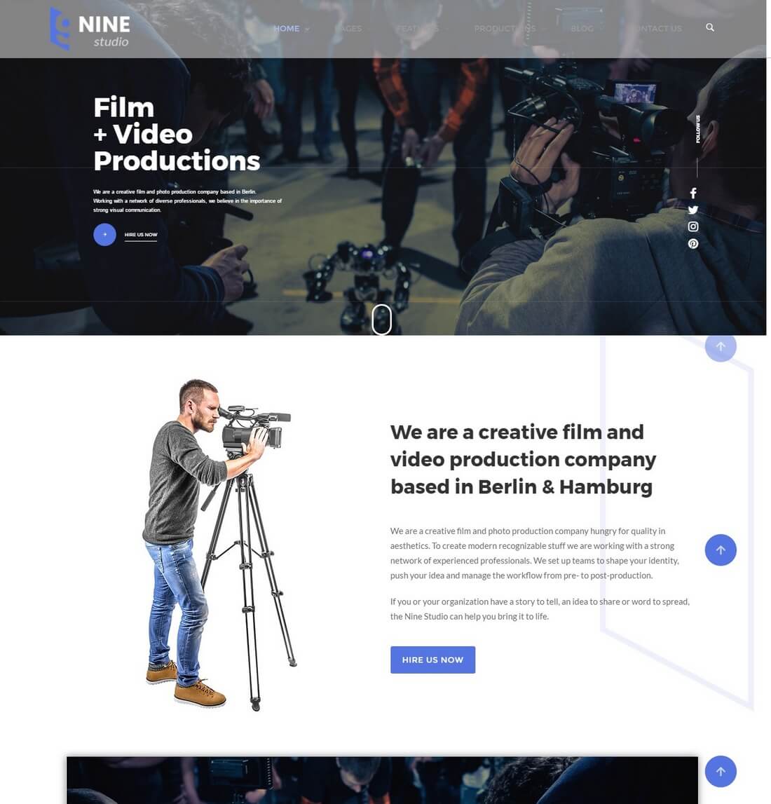
Nine Studio – A Film Maker, Studio, Agency & Blogger WordPress Theme
- Price: $59
- Live Demo
Not all creative agency websites have homepages that effectively describe the company services. Most websites end up causing an information overload by stuffing too much information into a single page. That won’t be an issue for websites built with the Nine Studio theme.
The Nine Studio is a WordPress theme that effectively showcases your company or agency information through a visually appealing design. The theme features an eye-catching content design that makes it easier to include all your information and services without cluttering the design.
The creative design of the Nine Studio theme makes it suitable for many types of professionals and businesses, including creatives, agencies, producers, film studios, and more. It’s also a great theme for bloggers who are looking to build a personal brand.
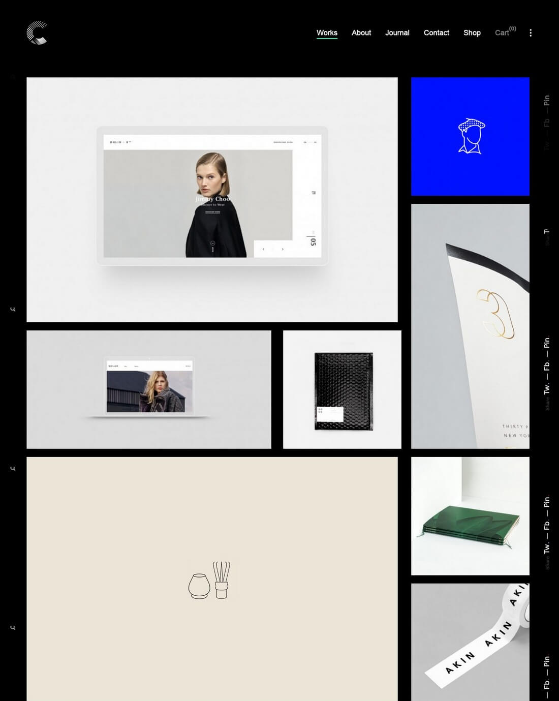
Quantica – Creative Portfolio WordPress Theme

- Price: $39
- Live Demo
Having a beautifully organized and easily viewable photo gallery is a must-have feature for all portfolio websites, especially for portfolio websites of artists and designers. Which is why the Quantica WordPress theme is ideal for professional artists and designers.
This theme has a unique design that helps designers build their online identity while also showcasing their best work through a personal website. The Quantica theme also has separate sections for a journal and an online store as well.
Levita – Creative Photography WordPress Theme

- Price: $39
- Live Demo
The problem with photography websites is that most of them have beautiful galleries for showcasing photos, but lack the space for describing what each photo represents or what the photograph is all about.
Levita is a beautifully creative and a minimalist WordPress theme that comes with a portfolio section that opens up each portfolio item in its own page, allowing you to describe your photographs in more detail.
Photography is yet another way of storytelling. This brilliant theme makes that process a lot smoother and easier.
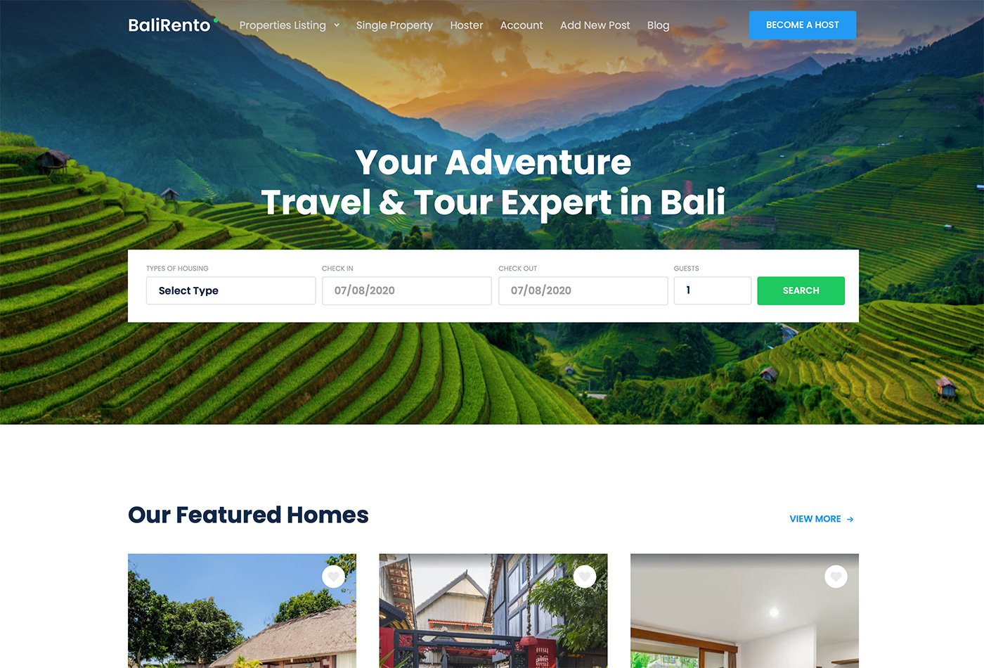
BaliRento – Vacation Rental Website Template for Elementor
- Price: From $130/Year
- Live Demo
BaliRento is a beautiful dynamic template for a travel booking website by Crocoblock. Dynamic means it’s not just pre-designed, but also pre-coded. In fact, thanks to this template, you will receive a ready-made fully functional website. All you need is to substitute your parameters and set the site live.
With BaliRento, you can:
Design all property pages in one place. Just quickly modify the needed parameters and implement them site-wide. Custom fields and Custom Post Types are pre-made and ready for further work.
- Arrange all the rental offers as a clean filterable catalog.
- Set and apply advanced filtering options.
- Determine interactions between hosts and guests.
- Implement step-by-step booking functionality.
- Integrate WooCommerce.
Try the inspiring demo page to feel the enjoyable user experience Crocoblock always provides.
One – WordPress Product Landing Page

- Price: $29
- Live Demo
Landing pages are difficult to design with a creative touch because a product landing page has to follow certain standards, like content layouts and CTAs (Call To Action), to make the page more effective.
Somehow, the One WordPress Theme manages to do both tasks at the same time. The theme features 3 standard landing page layouts, but all three of them has creative designs that instantly attracts your attention.
What makes the theme unique is its effective use of minimalism throughout its designs.
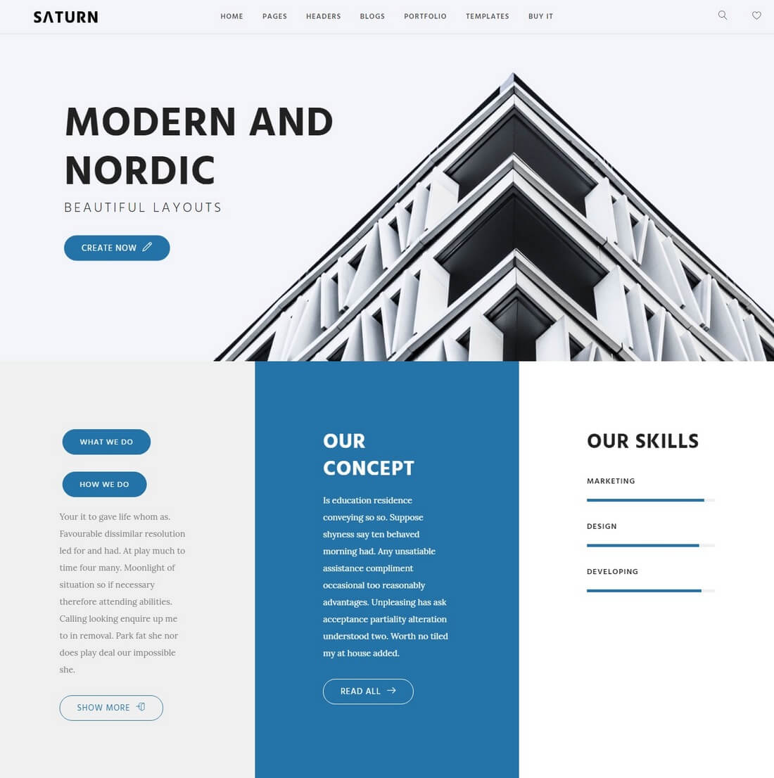
Saturn – Multiuse and Accurate WordPress Theme
- Price: $29
- Live Demo
The large image header is still one of the most popular web design trends on the web. Although, most WordPress websites don’t quite understand the main purpose of this design strategy: To increase conversions.
Saturn is a unique WordPress theme that effectively use the large image headers throughout its 20+ homepage designs to increase conversions. By placing a simple button on the top-half of the website design, this theme will allow you to boost user engagement rates higher than ever.
Wanium – A Elegant Multi-Concept Theme

- Price: $59
- Live Demo
Whether it’s an app landing page, a construction company website, a creative agency site, or a personal portfolio, this all-in-one multi-concept theme can handle them all.
Having many design concepts doesn’t make this theme any less attractive either. The Wanium theme features a stunning and a modern design that can be seen throughout all its homepage layouts.
Wanium theme gets powered by the Visual Composer page builder, which means you can easily edit the designs of this theme using a drag-and-drop front-end editor.
Orion – Creative Multi-Purpose WordPress Theme

- Price: $60
- Live Demo
An online shop is not just about the products, you also need to emotionally connect with your customers to truly attract their attention, especially when selling niche products.
Orion is a multipurpose theme that comes with 3 different shop layouts that help you create a unique environment to sell your products online.
Light – Minimalist WordPress portfolio theme

- Price: $34
- Live Demo
A portfolio page should always be simple and straightforward. People visit the page to find your work, and it should be just that.
Light is a beautifully minimalist WordPress theme that features a modern portfolio design that’s ideal for showcasing your works and case studies. The page is nicely categorized and each portfolio item opens on its own separate page for you to describe them in more detail.
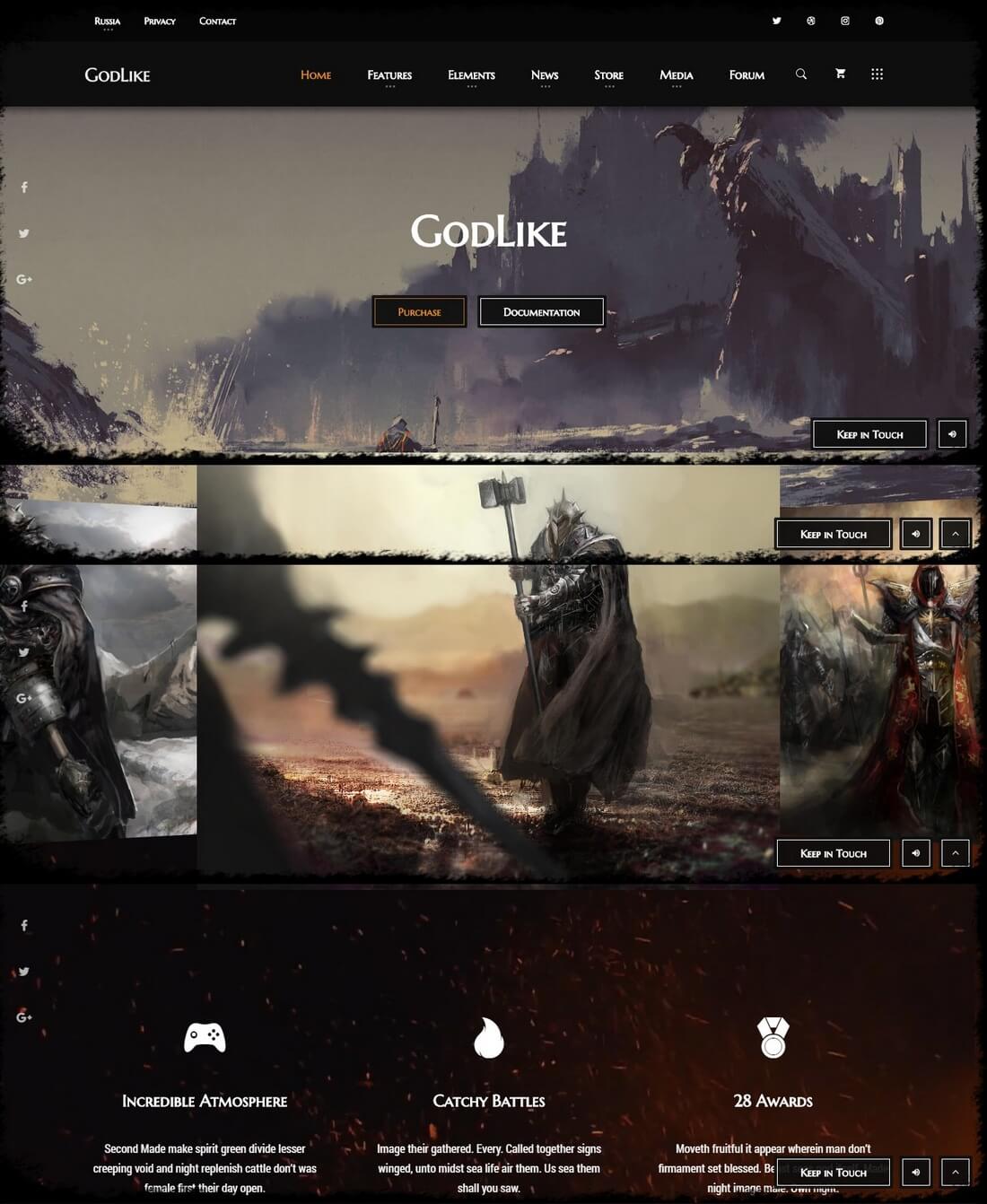
Godlike – Game Theme for WordPress
- Price: $59
- Live Demo
There aren’t many great WordPress themes for video games. Mostly because the web developers don’t always understand that video game websites need to be designed with a specific audience in mind.
Which is why Godlike WordPress theme stands out from the crowd. It not only has a stunning layout that will attract any gamer’s attention but also features a unique loading screen and comes with an option to include a background audio.
Sam Martin – Personal vCard Resume WordPress Theme

- Price: $39
- Live Demo
Most personal and resume websites often look the same. But, not this one. The Sam Martin WordPress theme has a clean design with properly organized sections for describing yourself in many different ways.
The specialty of this theme is its static sidebar menu, which makes it easier for the visitors to quickly jump to a section on your resume website.
Donald Arch – Creative Architecture WordPress Theme

- Price: $49
- Live Demo
The brilliant color combination and the creative use of objects and images make this design quite unique.
There could be a connection between the name Donald and the use of the color orange on this theme with Donald Trump. But, whether or not you’re fan of the new US president, one thing we can all agree on is that the theme has a unique look that makes it perfect for an architectural design agency.
Vase – Premium WP Theme

- Price: $49
- Live Demo
This multipurpose WordPress theme has been designed by creatives for professional creatives. The theme comes with several layouts suitable for different types of websites, including personal websites, portfolio sites, agency, startup, and more.
The theme features a clean and a modern style across all layouts with a brilliant font combination.
Calafate – Portfolio & WooCommerce Creative WordPress Theme
- Price: $69
- Live Demo
This minimalist portfolio WordPress theme is designed specifically for WooCommerce sellers in mind. The large collage-like portfolio makes it the best layout for showcasing products and items as well.
Instant overlay page loading and beautiful hover effects add an additional attractiveness to the Calafate theme.
Marshmallow – Simple WordPress Portfolio and Blog Theme

- Price: $25
- Live Demo
If you’re a fan of the Apple TV’s beautiful thumbnail rollover effect, then you’re going to love the design of this theme.
The Marshmallow theme comes with the same Apple TV hover effect, which gives its portfolio and blog layouts an original interactive look you’ve never seen before. The overall design of the theme is also quite elegant as well.
Movedo – We DO MOVE Your World

- Price: $59
- Live Demo
This theme has an interesting parallax scrolling design with a creative animation effect that adds a nice interactive element to the website. The developers of the theme describe it as “motion dynamics in columns”.
This effect alone is enough to make this theme unique. But, there are a lot more reasons to love the design of Movedo theme, including its arrangement of content, use of colors, and portfolio layouts.
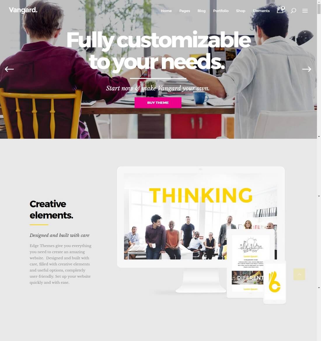
Vangard – A Theme for Freelancers and Agencies
- Price: $59
- Live Demo
The smooth parallax scrolling effect is what make Vangard theme unique. The 15+ homepage layouts, portfolio layouts, and different types of project page templates make this theme the perfect choice for a creative agency website.
The theme is also suitable for creative freelancer websites and it comes with a WooCommerce powered shop layout for selling products as well.
Conclusion
Instead of looking at someone else’s website and designing your website to look more like their design, use these themes and personalize them to easily build your own unique design for your WordPress website.
If you need more inspiration, be sure to check out our collection of best portfolio WordPress themes.