Introduction to CSS3 – Part 5: Multiple Columns
Multiple columns are a major facet of laying out text – newspapers have used them for decades. So important are they that it is amazing that the current way to achieve a multi column layout is one of the most complex techniques for a new designer to grasp.
The Ultimate Designer Toolkit: 2 Million+ Assets
Envato Elements gives you unlimited access to 2 million+ pro design resources, themes, templates, photos, graphics and more. Everything you'll ever need in your design resource toolkit.

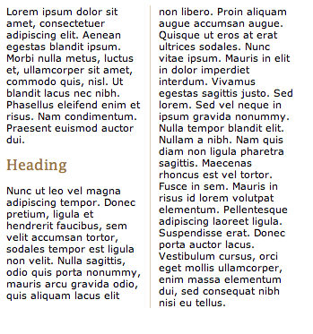
CSS3 introduces a new module known, appropriately, as multi-column layout. It allows you to specify how many columns text should be split down into and how they should appear. As usual, examples can be found below:
Multiple columns using CSS3
At present, this feature is available in Firefox and Safari 3. When the module becomes finalised in the CSS3 specification it will be adopted by other browsers and rolled into their updates.
There are four properties which relate to the multiple column layout in CSS3, allowing you to set the number of columns, width, gap between each column and a border between each:
- column-count
- column-width
- column-gap
- column-rule
At present, a browser specific selector is also needed to identify whether Safari or Firefox should display the selector. The code to be used to create a two column layout with a 1px rule between columns would be:
.multiplecolumns {
-moz-column-width: 130px;;
-webkit-column-width: 130px;
-moz-column-gap: 20px;
-webkit-column-gap: 20px;
-moz-column-rule: 1px solid #ddccb5;
-webkit-column-rule: 1px solid #ddccb5;
}
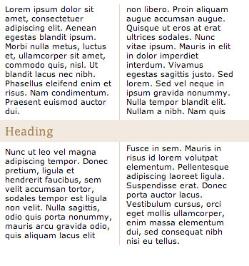
Spanning columns
It could also be the case that you would like an element to span more than one column – a heading, table or image for instance. This is facilitated in the specification through the use of:
h2 {
column-span: all
}
Numbers can also be used to allow the element to span a certain number of columns. At present this feature isn’t implemented in any major browsers, but should provide much needed additional flexibility when designing around this feature. It would allow you to achieve effects such as:
In the meantime
It could still be a while before this feature is supported on enough systems to allow widespread use. A List Apart published in 2005 a JavaScript implementation of this capability which allows you to use selectors in the same way and offers support in all major browsers. It should also degrade nicely when the feature is widely adopted and the JavaScript is no longer needed. It is a great interim solution if you’re desperate for multiple columns on your site.
In conclusion…
Multiple column layout will save a huge headache for many designers, allowing greater control of how copy is displayed. You can read the full specification for multi-column at the W3 site if you’d like more information about the feature.
The next, and final, article in this series will be looking at the different background features available in CSS3 including using more than one background for an element, and specifying the size of backgrounds. Remember, to see live examples of these features, take a look at our CSS3 example page.