Creating a jQuery Dashboard

The ‘Dashboard’ feature on a Mac looks great, and the menu allowing you to add/remove widgets is a well designed feature. A similar effect can add a whole new level of functionality to a website, providing a simple slide-down menu at the top of a page. This tutorial will walk you through the process from beginning to end.
Before getting started, you may like to check out the demo, or download full source code here.
2 Million+ Digital Assets, With Unlimited Downloads
Get unlimited downloads of 2 million+ design resources, themes, templates, photos, graphics and more. Envato Elements starts at $16 per month, and is the best creative subscription we've ever seen.


Starting in Photoshop
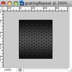
1) Create a grate repeat background.
Start by creating a 56 (W) x 64 (H) px image in Photoshop. Then make a 3 coloured gradient going from #111111 to #313131 and finally back to #111111. It should look like this.
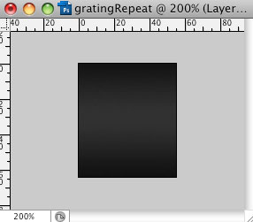
Now it’s time to add the dimples.
Select the brush tool and pick a square brush that is 2px in size and #000000. Create a new layer and make sure it is selected. Begin by making one dot anywhere on this new layer. Now move that dot 3px from the top of the image and 1px from the left side. You can then duplicate this layer 11 times (so you have a row of 12 dots in total) and each time move the dot down 5px.
You can now merge all of these layers (except for the background.) Duplicate this new row of dots 6 times, and each time move the row to the right 8px.
Using the first row created, duplicate it one more time and move it 4px right and 2px down. This new row can also be duplicated 6 times and each moved 8px right. You should now have the background of the dashboard.
2) Find an icon pack like the one used in this tutorial. Mine was found at: http://www.smashingmagazine.com/2008/10/01/dellipack-2-a-free-icon-set/
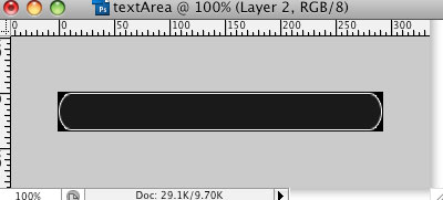
3) Create a text area for the icon tips.
Create a new image 292px (W) x 34px (H) and create a new layer. Delete the background layer. Now draw a rounded rectangle path again just like we did for the icon, however this time it wants to be 290px (W) x 32px (H) and make it a selection again filling it with a white. Set the fill on this layer to 10%. Now all that is left to do is add a 1px white stroke around it leaving you with this. (I’ve put a black background on the example that you will not have, just so you can see what it should look like)
Now we are ready to put some HTML and CSS into this and make it!
HTML and CSS
In order to build this example, you’ll need the latest J-Query release.
First thing to do is prepare the HTML. We are going to need to DIV tags, one as an overall container of everything, which will ensure that the dashboard spans the width of the browser window. The other will act as a container for the icons, keeping them restrained within a 945px width. This is to ensure they will all be visible on most common screen resolutions.
<head>
<meta http-equiv="Content-Type" content="text/html; charset=UTF-8"/>
<title>Dashboard</title>
<link href="index.css" rel="stylesheet" type="text/css" />
<script type="text/javascript" src="jquery-1.2.6.js"></script>
<body>
<div id="advanceMenu">
<div id="advanceContainer"> </div> </div> </body> </html>
A you can see from this I have attached a stylesheet called index.css, I have added a few styles on that style sheet to ensure these DIV will look and perform the way I wish.
#advanceMenu {
background:url(images/gratingRepeat.png) repeat-x;
height:64px;
display:none;
}

#advanceContainer {
width:945px;
margin:auto;

}
The background image has a repeat-x on it to enable the image to span the width of the browser window. The height should be the same height as the gratingRepeat.png we created earlier.
The advance container has a 945px width on it to allow even the smallest screen resolutions to view the dashboard in full. I always design my websites to a minimum of 1024 x 768 because this tends to be the most common screen resolution at the time of writing. Also, by having margin: auto set on the container, the browser will centre the icons no matter how wide the browser is set to. For this to work, the element must have a width set.
The next thing we need to add is the UL, which will hold all of our icons.
<ul id="advanceList">
<li class="home"></li> <li class="monitor"></li> <li class="green"></li> <li class="interact"></li> <li class="people"></li> <li class="phonebook"></li> <li class="school"></li> <li class="vault"></li> <li class="world"></li> <li class="plus"></li>
</ul>
As you can see each LI has a different class attached to it. This is so that we can assign different attributes to each icon. Be sure to name your classes to correspond to the icon so that you will understand where to put everything.
First we will go through the main areas of the styling on the UL and the LI.
ul {
list-style:none;
margin:0; padding:0; /*fixes ul padding and margin */
}

ul#advanceList {
float:left;
width:645px;
margin-top:6px;

}

#advanceList li {
height:48px;
width:48px;
float:left;
margin-left:15px;

}
Firstly, the UL list-style: none takes off any unwanted bullet points. I have also put a padding: 0 and margin: 0 here, this should stop any browser compatibility issues placing things in unexpected areas. I have put these to attributes on UL site wide because we will use another UL later and these settings will apply as well.
On the advanceList specifically I have chosen to position the icons using the float method. (I find this gives me the greatest control over positioning.) The width is important when floating to ensure accurate placement. I have chosen 645px because we have to leave space for the tips area, which will be added later.
The LI within this UL have then been given a height and width (the same height and width as the icons) and then floated left. Doing this places the LI in a horizontal line overwriting the default vertical alignment of UL. The margin-left here is placed on every individual LI meaning there will be a 15px gap between each icon.
The next section of CSS needs to be repeated and slightly modified for each icon class. I will include one example for guidance. It’s very simple, set the background to the icon.png and then set the background for the icon’s hover state. This means that when the icon is hovered over (in all browsers except for IE6) the icon will change colour.
.info {
background:url(images/icon.png);
}

.info:hover {
background:url(images/iconHover.png);
}
Make sure you replicate this changing the class for every icon you choose to use. Make sure you also change the image that they use as a background.
Finally, we will add the Tip area and style it. The HTML is very similar to that of the icon set. Using UL and LI. However, we only use one LI with a series of different DIV CLASSES within it.
<ul id="contactList">
<li class="advanceTip"> <div class="plusTip">Menu Item 10</div> <div class="worldTip">Menu Item 9</div> <div class="vaultTip">Menu Item 8</div> <div class="schoolTip">Menu Item 7</div> <div class="phonebookTip">Menu Item 6</div> <div class="peopleTip">Menu Item 5</div> <div class="interactTip">Menu Item 4</div> <div class="greenTip">Menu Item 3</div> <div class="monitorTip">Menu Item 2</div> <div class="homeTip">Menu Item 1</div> </li> </ul>
While this may look like a daunting piece of code it is in fact very simple. Each DIV relates to one icon and using CSS only one or no DIV will be visible at a time. Be sure to give every DIV a separate class relating to the icon it will be highlighting. This will be needed in the next step.
ul#contactList {
margin-top:16px;
float:right;
width:292px;
}

.advanceTip {
background:url(images/textArea.png) no-repeat;
height:34px;

}

.plusTip, .worldTip, .vaultTip, .schoolTip, .phonebookTip, .peopleTip, .interactTip, .greenTip, .monitorTip, .homeTip {
display:none;
height:34px;
width:292px;
text-align:center;
line-height:35px;
color:white;
font-family:Verdana, Arial, Helvetica, sans-serif;

}
To start, I have floated the UL right and given it a width. This will position the tip area to the right of the icons, as the width given to the icon UL allows both elements to sit on the same line.
I have then given the class a background, loading in the textArea.png created earlier. This has been given a height to enable it to be visible.
I have every DIV class to display: none meaning that every DIV within the LI will initially be hidden. We will use javascript to enable them later.
Every DIV is set to be the same height and width as textArea.png, this is so that we can position the text within precisely. Text-align: centre moves all of the text to the middle of the DIV and therefore the text area. Finally, the line-height:35px; ensures the text is vertically centred. This value will differ depending on the font-size and font-family choice, trial and error may be needed a little here.
Finally, we will need a button to click to make the dashboard visible. Outside of the two DIV we have created insert a link and give it a class of advanceMenuBtn. This will be needed when calling it within the javascript later.
</div>
<a href="#" class="advanceMenuBtn"><img src="images/showhide.png" alt="Show and Hide the Dashboard" border="0" /></a>
<a href="#" class="closeMenuBtn"><img src="images/close.png" alt="Show and Hide the Dashboard" border="0" /></a>
</body>

</html>
If you load this into a browser you will be able to see the dashboard at the top and the icons will change colour when you place your mover over them, very exciting!
Now it is time to add the javascript functionality. Be sure to place all of the subsequent javascript within the HEAD tags at the top of your page.
<script
$(document).ready(function(){
$("a.advanceMenuBtn").click(function () {
$("a.advanceMenuBtn").toggle();
$("a.closeMenuBtn").toggle();
$("div#advanceMenu").slideToggle("slow");
});

$("a.closeMenuBtn").click(function () {
$("a.advanceMenuBtn").toggle();
$("a.closeMenuBtn").toggle();
$("div#advanceMenu").slideToggle("slow");
});

});
</script>
This first chunk of code toggles the visibility of the dashboard when the advanceMenuBtn button is clicked. To make sure that the dashboard begins invisible you should now place a display: none on the advanceMenu DIV in the CSS.
The second line of this chunk sets up the function to be ready to run when the page is ready and loaded, meaning that it will work any time the page is visible. The next line focuses on the advanceMenuBtn and sets up another function to run when that button is clicked. When using JQuery to focus on elements the syntax used is very similar to that of CSS. Firstly you declare the element type with the ‘a’ and then you declare the class using ’.advanceMenuBtn.’
The next line then calls the dashboard and declares what function is to be performed and states a variable telling it how to perform. .slideToggle is a JQuery function that is built into the framework and has different speed variables attached to it. You can choose between slow, normal or fast. The dashboard will now appear hidden when viewing the page. Clicking on the link will then make the dashboard appear.
The final piece of javscript will cause the text area to show the tip when the user hovers over an icon. Again this script is very repetitive so I will show you one example that needs to be slightly adjusted for the other icons.
<script type="text/javascript">
$(document).ready(function(){ $("li.home").mouseover(function () {

$("li.advanceTip .homeTip").show();

});

$("li.home").mouseout(function () {
$("li.advanceTip .homeTip").hide();
});

});

</script>
This script is again very simple and very effective. Once again the function is ready to be used when the page is loaded, as stated by the third line. The next line then calls on the icon with a class of info and sets a function to run when the user puts their mouse over it.
Next the class which displays the piece of text associated with that icon is focused on and told to ‘.show’ when this happens. This function then needs to be reversed in order for other snippets of text to show when other icons are hovered over.
The last few lines are doing the exact reverse of the first function changing ‘mouseover’ to ‘mouseout’ and ‘.show’ to ‘.hide’
These two function then need to be repeated for every icon changing the classes that are being called to coordinate with the icon in question.
Now we should be ready to see it working in it entirety!
Check out the demo and download full source code here
Well done and I hope you can put this to good use.
Please note that due to IE6 not understanding the :hover function this example will be of very limited use in that particular browser. However there are fixes for it that can be found using further javascript.