5 More Typography Do’s and Don’ts Everyone Should Know
Yesterday we brought you part one of our ten do’s and don’t for working with typography. Today we’ll wrap up with five more!
Read on to see if you’re guilty of any of the following blunders and how to make sure you never do it again.
2 Million+ Digital Assets, With Unlimited Downloads
Get unlimited downloads of 2 million+ design resources, themes, templates, photos, graphics and more. Envato Elements starts at $16 per month, and is the best creative subscription we've ever seen.


Don’t: Put Text Over a Busy Background
I bring this problem up frequently simply because it’s something that countless people struggle with. Any time you’re working with photos, it can be really hard to incorporate a text overlay. It sounds easy, but in practice you don’t always have a nice solid blue sky to work with. Instead, the photos you have to use look more like the following:
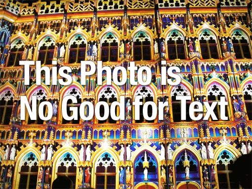
Like many designers, I tried my best to make this text stand out on its own merit. I used a bold typeface, a white fill, a dark drop shadow and even a little bit of a stroke! Still, the readability is horrid.
At this point, it’s pretty easy to get frustrated and set off in search of a better photo, or worse, give into the “good enough” mentality. This phrase is the designer’s mortal enemy and should be avoided at all times.
It turns out, you can combine text with almost any image in a minute or less with one simple, stylish trick.
Do: Give Text a Containment Device
In the example below, I still used my crazy photo. I also maintained the integrity of the image: you can clearly get a feel both for the beautiful architectural repetition and the bright colors. Screening the image opacity back is a great solution at times, but not if you really like the image in its current state.
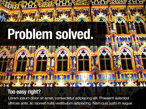
It’s important to note that the example above is a generalization: one possible and typical solution of many. The key here is to think of a way to “contain” your text in something with a simpler fill and thereby set it apart from the background. You can use a color bar, a circle or even another photo!
Be wary of becoming a one-trick pony and always resorting to the same old design fixes. Attempt to put some fresh thought into each new challenge that arises while leveraging past experience and knowledge.
Don’t: Mix Fonts that Are Too Similar
This design tip is completely counterintuitive isn’t it? Am I really telling you to not mix similar fonts? Isn’t design about consistency?
Yes, design is about consistency, but sometimes two things that are too much alike without being perfectly alike can be visually confusing. Consider the type examples below.
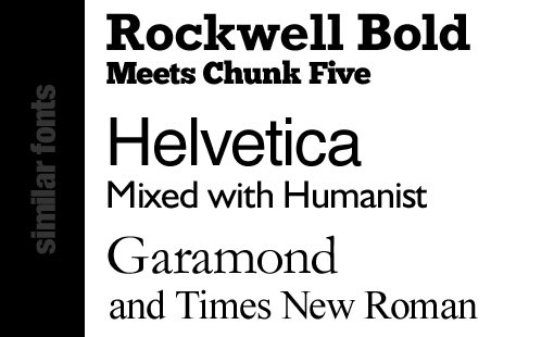
Now, a non-designer might not give a second thought to this example but all you designers out there should be uncomfortable with these pairings. Each group contains typefaces that are extremely similar, but they don’t quite match. The letterforms are slightly off, the serifs are weighted differently and even the x-heights vary. The question you need to ask yourself is, “If I want them to be the same, why not just make them the same?”
There’s nothing wrong with having two pieces of text look the same, only something wrong with two pieces of text that almost look alike but are different enough to be distracting.
Do: Use Different Font Styles
In design, if you want two pieces of text to look alike, the solution is easy: use the same font! If you want them to look different, then pick a font that’s obviously very different.
Using some of the same lines from the previous example, you can create some perfectly stylish font pairs.
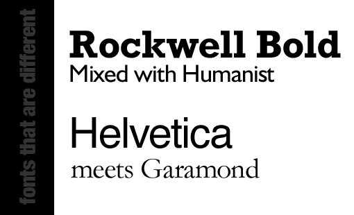
Try mixing serifs with sans-serifs, slab fonts with modern fonts; you get the idea. Keep it simple and make sure you have some contrast between the two.
Breaking the Rules
Avoiding similar typefaces is one of those concepts that’s not really so clear cut. If you’re a beginner, it’s a good thing to live by. As you get better with typography though, you’ll find that there are clear instances where breaking this rule is perfectly acceptable. Remember, rules are made to be broken, just make sure you know what you’re doing!
As an example, consider the following font pair:
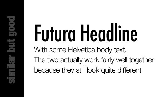
Here I’ve mixed Futura with Helvetica. Both of these are modern sans-serifs and so you would think it’s not a good idea to mix them, but they look great together. The reason is that I actually still followed the heart of the rule that I set out before: contrast. The two typefaces work because they look very different: one is big, one is small, one is bold, the other is light, one is condensed, the other has its original width, etc.
Don’t: Use Too Many Font Styles
The previous tip about using different fonts styles can easily be taken too far, so it should always be followed with advice to take it easy and not get carried away.
Anyone with access to an abundant font folder has been guilty of this crime at least once in their life. There are just so many fun fonts out there, how can you possible choose? Nay I say, use them all!
As you can see, the result is a cluttered mess. We might genuinely need different styles for each of these blocks of text, but looking to completely different fonts just isn’t the solution.
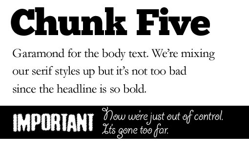
Do: Use 2-3 Families
One brilliant thing about typefaces is that many of them come with several fonts that perfectly complement each other. Why spend an hour browsing your fonts folder when the font you choose has a solid secondary choice built in?
Let’s take another look at the example above, this time redesigned to stay within two font families (not to be confused with the CSS font-family property).
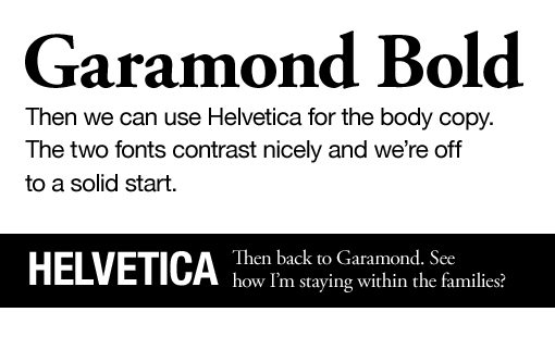
As you can see, each of the four areas still maintained a unique look, but we’ve really only used two governing typefaces: Helvetica and Garamond. This gives us both the variety we want and the consistency that the design needs.
Don’t: Use Cliché Typefaces
This one is rough to follow because some fonts are cliché for a reason: they’re good. Take Helvetica for example, which I’m pretty sure has entire cults dedicated solely to its continual worship. This doesn’t stop making it a really good font, just perhaps an overused one. I still use Helvetica plenty though (see every image above) so don’t think I’m going to tell you to avoid it.
In my mind, there are more pressing concerns for typeface overuse. The one that everyone mentions is of course Comic Sans, the bane of a designer’s existence. However, we’ve reached a point where real designers aren’t out there tossing Comic Sans around too much. The font that has really been bugging me lately is Felt Tip. It’s everywhere!
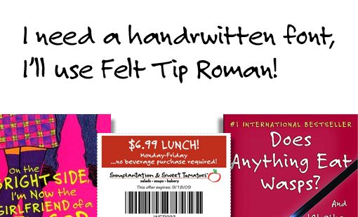
It has a certain ugly but friendly feel that people love and can genuinely be mistaken for handwriting. However, in my opinion, its ubiquity has defeated its usefulness. Let’s move on to something else now folks.
Do: Find Something More Unique
The days of complaining about not having access to enough fonts are over. If you have access to the Internet, you have access to tons of great fonts, many of which won’t cost you a dime.
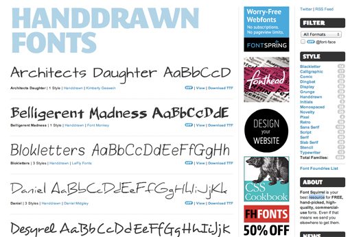
Most font sites, like FontSquirrel have entire sections dedicated to free hand drawn fonts, so there’s really no reason to ever use Felt Tip again!
Somewhere in this rant I had a point: avoid cliché fonts. As a designer, it’s your job to notice the works around you. Once you begin seeing one of your favorite fonts all over the place, it may be time to hit up the font sites for an alternative.
This rule mostly applies to unique looking fonts. That’s why Comic Sans and Felt Tip stand out so much, they’re so unique that you can spot them from a mile away. Old standards like Helvetica get a pass simply because most of the world doesn’t even see them.
Don’t: Imagine That Type Does Your Job For You
This one is a biggie and is fully meant to make many designers angry. I’m tired of hearing about how “typography is 95% of design” or “99.9% of design” or whatever statistic someone completely pulled out of thin air this week.
Typography is a huge part of design, but so is layout, color theory, whitespace, contrast, repetition and a million other principles. If you’ve got strong typography but poor color contrast, no one can read it. If your type is beautiful but your photos are ugly, everyone still hates your website. If your kerning is perfect but your interface is a mess, no one will use your app. In short, if you’re awesome with type, you can still be a horrible designer.
Design is holistic, you can’t just break off your favorite piece and declare it the most important. There are several aspects that you are expected to understand and master just as much as type.
The biggest problem that I see with this type love affair is that designers buy into it so much that they think they get a free pass: slap some type on a page, make it look pretty and call it a day. This is great for a very small niche of design, but as a general practice for the design industry, it’s weighing us down.
Someone “designed” that typeface you’re using. Typing a headline with it doesn’t make you a designer any more than serving takeout to your dinner guests makes you a chef. The result can and does often look great, but that’s because of the real designers who put in countless hours dishing out a beautiful typeface.
Do: Leverage Typography to Create Strong Designs
That being said, I should say that I’m 100% behind the typography craze. I’m a total type nut and can spend hours looking at type galleries.
You should in fact strive for the absolute best typography you can create. This is an integral part of a solid, professional design, a goal which simply can’t be achieved without good type.
My point is simply that, upon getting your type exactly in the state that you need it, you are not in fact a mere percentage point away from a completed design. You need to learn the other principles involved in design and shouldn’t neglect them with the excuse that type is everything. Instead, leverage strong typography as one of the main pillars in a design that reflects a solid understanding of basic design principles.
Conclusion
This concludes our ten typography do’s and don’ts that everyone should know. Be sure to check out part one for the other five tips!
Also, before you go, do me a favor and leave a comment below with your thoughts on all of the above. I’d love to hear them!
Image credit: PitsLamp photography