Introduction to CSS3 – Part 2: Borders
For the second part of our series on CSS3, we’ll be taking a look at borders. Everyone who uses CSS is familiar with the border property – it’s a great way to structure content, create effects around images and improve page layout.
CSS3 takes borders to a new level with the ability to use gradients, rounded corners, shadows and border images. We are going to look at each of these in a bit more detail, using examples where possible.
2 Million+ Digital Assets, With Unlimited Downloads
Get unlimited downloads of 2 million+ design resources, themes, templates, photos, graphics and more. Envato Elements starts at $16 per month, and is the best creative subscription we've ever seen.

All the examples shown below can be seen at our CSS3 examples page. Many, however, can only be appreciated in the latest builds of various browsers:
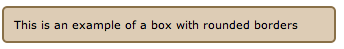
Rounded Borders
Achieving rounded borders using current CSS coding can be tricky – there are numerous methods available, but none are extremely straight forward. Creating individual images for each border is often needed in addition. Using CSS3, creating a rounded border is incredibly easy. It can be applied to each corner or individual corners, and the width/colour are easily altered. The CSS code is:
.border_rounded {
background-color: #ddccb5;
-moz-border-radius: 5px;
-webkit-border-radius: 5px;
border: 2px solid #897048;
padding: 10px;
width: 310px;
}
Gradients
Gradient borders can look effective if used correctly. This code is a little more complex, requiring you to define each colour of the gradient. The CSS code is:
.border_gradient {
border: 8px solid #000;
-moz-border-bottom-colors:#897048 #917953 #a18a66 #b6a488 #c5b59b #d4c5ae #e2d6c4 #eae1d2;
-moz-border-top-colors:  #897048 #917953 #a18a66 #b6a488 #c5b59b #d4c5ae #e2d6c4 #eae1d2;
-moz-border-left-colors: #897048 #917953 #a18a66 #b6a488 #c5b59b #d4c5ae #e2d6c4 #eae1d2;
-moz-border-right-colors:#897048 #917953 #a18a66 #b6a488 #c5b59b #d4c5ae #e2d6c4 #eae1d2;
padding: 5px 5px 5px 15px;
width: 300px;
}

Box Shadows
Adding a shadow to an element is difficult at present – it is a good way to differentiate a certain area, but as with any effect, it should be used sparingly. The CSS code is:
.border_shadow {
-webkit-box-shadow: 10px 10px 5px #888;
padding: 5px 5px 5px 15px;
width: 300px;
}

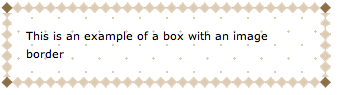
Border Images
Border images are one of the most useful additions – I’m really looking forward to discovering how people choose to use them. CSS has the ability to repeat, or stretch a border image as you choose. The CSS code is similar to the following (it varies between browsers at present):
.border_image {
-webkit-border-image: url(border.png) 27 27 27 27 round round;
}
In conclusion…
Borders are revolutionized! These additions in CSS3 are bound to save you a huge amount of time as a designer. They go a long way towards simplifying layouts and allow you to create visually appealing boxes without even opening Photoshop.
The next article in this series will be expanding on a new area in CSS3, Text Effects. Remember, to see live examples of these features, take a look at our CSS3 example page.