Web Design Critique #28: Holds Worth Design
Every week we take a look at a new website and analyze the design. We’ll point out both the areas that are done well i addition to those that could use some work. Finally, we’ll finish by asking you to provide your own feedback.
Today’s site is Holds Worth Design.
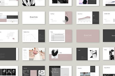
2 Million+ Digital Assets, With Unlimited Downloads
Get unlimited downloads of 2 million+ design resources, themes, templates, photos, graphics and more. Envato Elements starts at $16 per month, and is the best creative subscription we've ever seen.
If you’d like to submit your website to be featured in a future Design Critique, it just takes a few minutes. We charge $24 for critiquing your design – considerably less than you’d pay for a consultant to take a look at your site! You can find out more here.
About Holds Worth Design
“Holds Worth Design is an award winning Web Design, Graphic Design, and Communications studio in Edmonton, Alberta. Holds Worth websites have been featured on several prestigious ‘Best Design’ galleries including thebestdesigns.com, coolhomepages.com, newwebpick.com, dailyslurp.com, creattica.com, and many more.”
Here is a screenshot of the homepage:

First Impressions
Without a doubt, this is a really attractive design. The colors are beautiful, the imagery is vivid and the layout is solid. The designer has done an excellent job on the overall aesthetic and anything that we suggest will be fairly minor.
Below we’ll break up the design piece by piece so we can be sure to hit on everything and examine what’s working and what isn’t.
Header

If this header is meant to grab the user’s attention and pull them in, it’s working. The dark blue and brown banners trimmed with gold contrast beautifully with the blurry photographic background. It’s a stunning graphic that really makes the page.
One interesting aspect about this header though is the time period that it suggests. At a glance I see a site with a castle logo and triangular banners that feel perfect for the castle motif. However, the rest of the page jumps straight into the industrial revolution (the time period is further confused by the blurry bubbles photo).
As much as I’d hate to suggest changing the great design, it’s quite a confusing conglomeration. It feels a bit like the designer changed his mind halfway down the page.
I would suggest that you consider keeping the basic layout below but creating graphics that fit with the header a bit better. Keep in mind that very few of your visitors will be as OCD as I am so this isn’t really a huge issue that needs to be addressed immediately.
Navigation

The navigation here is a pretty basic dropdown menu. The important aspect here is functionality. The developer used some JavaScript to smooth out the menu with transitions and delays. However, the menu actually still works fairly well without JavaScript enabled. This graceful degradation shows that whoever built the site was willing to take the time to do it right (though the slider obviously loses functionality).
Content Slider

The image slider cycles between three images, shown stacked above. Each section is attractive and unique and the transitions are buttery smooth thanks to jQuery.
One thing that I find a little strange about this section is that the image slider is slightly wider than the content below it.

Since the site is set up on a center-alignment I don’t really take issue with the different widths, only how similar they are. When sizing objects like this on your page, be sure to make them either identical or noticeably different. Situations like these where elements are almost but not quite the same size look more like an accident instead of an intentional design decision.
The easiest fix here is to just space out the three boxes below a little bit more so that the line up with the bounds of the image slider.
Boxes

Apart from the visual inconsistencies I mentioned above, this section looks great. I love the old school graphics and how the text wraps around them.
I also find these boxes to be interesting on a conceptual level. They serve as a sneak peek into pages further into the site. Links have already been presented for these pages via the navigation but this gives users who have scrolled down further another opportunity to jump to those pages. It might be a bit redundant but it likely increases the number of clicks on a typical visit.
Footer

The footer is just a few simple columns of text so there’s not much to comment on. It’s simple and functional, a great combination. However, it is also floated way over on the left side of the page. Left alignments are great and I prefer them to center alignments, but in this case it breaks the flow of the page as everything above it is floated to the center.
Don’t confuse this as direction to change the alignment of the text. The text columns should remain left-aligned but the section as a whole should be centered on the page.
Your Turn!
Now that you’ve read my comments, pitch in and help out by giving the designer some further advice. Let us know what you think is great about the design and what you think could be stronger. As always, we ask that you also be respectful of the site’s designer and offer clear constructive advice void of any harsh insults.